Montoya Lawn & Outdoor Services Identity Branding
When I worked on a freelance project for a local lawn and outdoor services company, it became clear that they needed more than just a logo — they needed a complete brand identity. From a designer's perspective, a logo alone wouldn't effectively communicate the breadth of their services or create a strong connection with their target audience.
My Process
- Kickoff Meeting
- Competitive Analysis & Research
- Brainstorming / Early Ideation / Sketching
- Exploration / Mockups
- Present Options to Client
- Iterate on Feedback
- Finalize
Brand Attributes
We began by discussing their core values, the personality of their business, and how they wanted to be perceived by potential customers. We identified key attributes and keywords that captured the essence of their brand. This process involved deep discussions about their mission, vision, and target audience. These attributes became the foundation for guiding not only the brand’s personality but also the direction of the design.
- Reliable – Dependable and consistent service delivery
- Eco-friendly – Commitment to sustainable and environmentally conscious practices
- Customer-focused – Prioritizing customer satisfaction and personalized service
- Detail-oriented – Focused on precision and thoroughness in every job
- Trustworthy – Building long-term relationships through honesty and transparency
Shape Exploration
Options Presented to Client
I presented two concepts to the client, each highlighting different aspects of the lawn care imagery we discussed. This allowed the client to provide feedback on which direction resonated more with their vision, guiding the final design.
Concept A
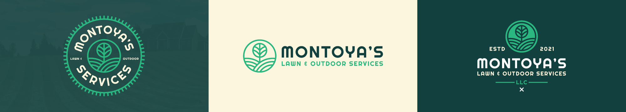
Concept B
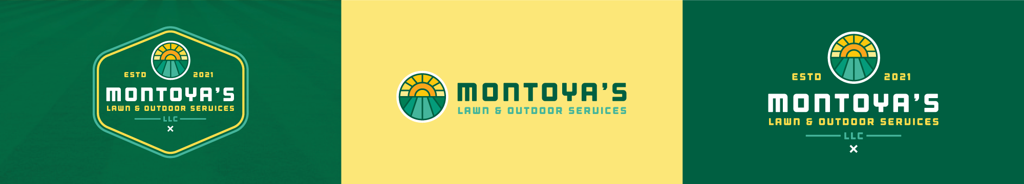
Final Branding
As I finalized the branding, the design was heavily inspired by classic, nostalgic elements of landscaping. We based the visual identity on the image of an old-fashioned lawn mower with blades, which symbolizes tradition and craftsmanship, along with rolling hills of freshly mowed lawns, evoking a sense of care and precision.
From a design perspective, I incorporated these concepts through simple, clean lines and shapes to represent the mower's blades, giving the logo a timeless, vintage feel while maintaining a modern aesthetic. The flowing lines of rolling hills were integrated to add a natural, organic touch that resonated with the company’s connection to the environment.
By blending these visual cues, the branding reflects both the technical skill and the beauty of well-maintained landscapes, reinforcing the company’s commitment to quality service and environmental stewardship. The overall design speaks to both the heritage of lawn care and the forward-thinking approach of the company.
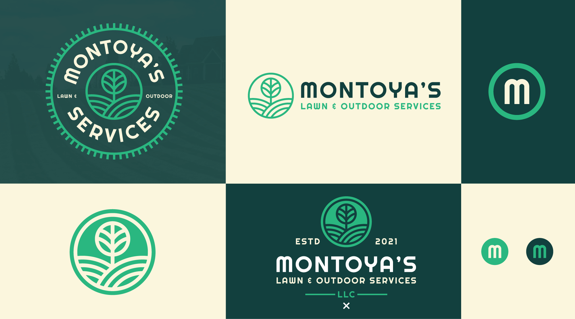
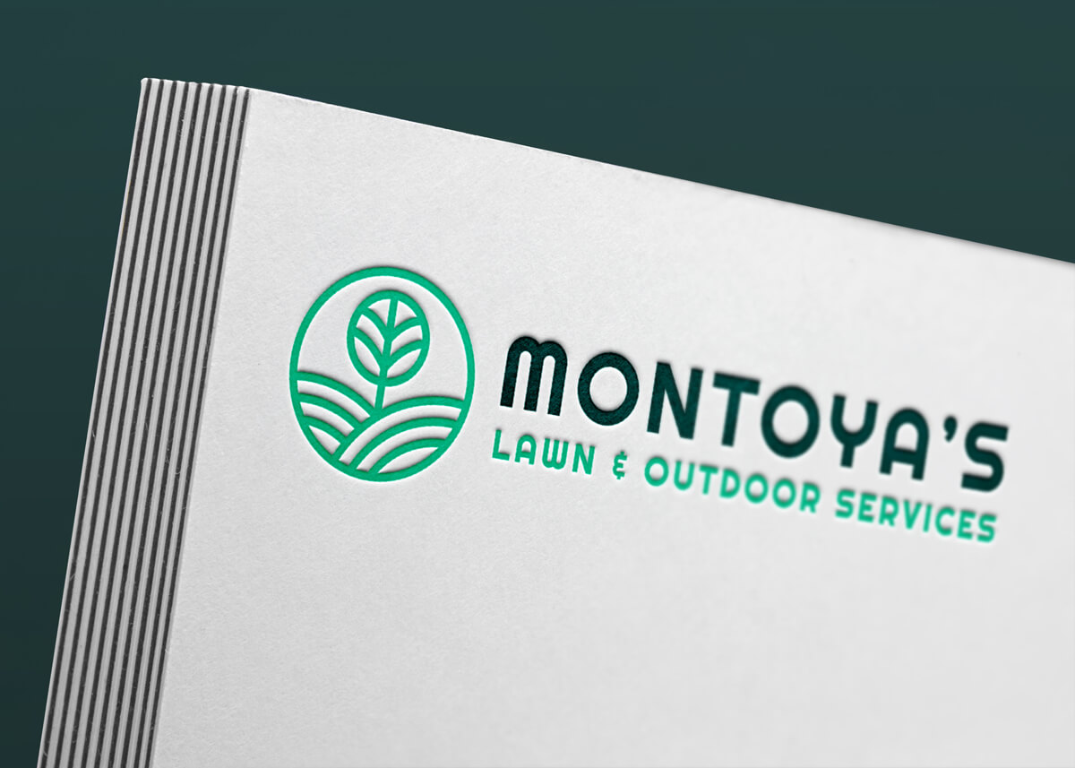
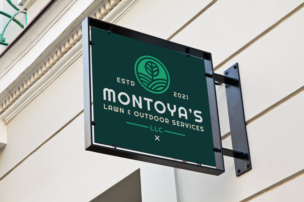
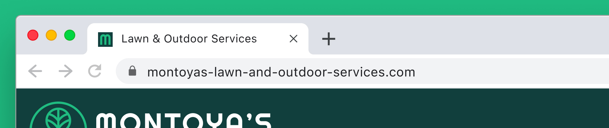
In Application
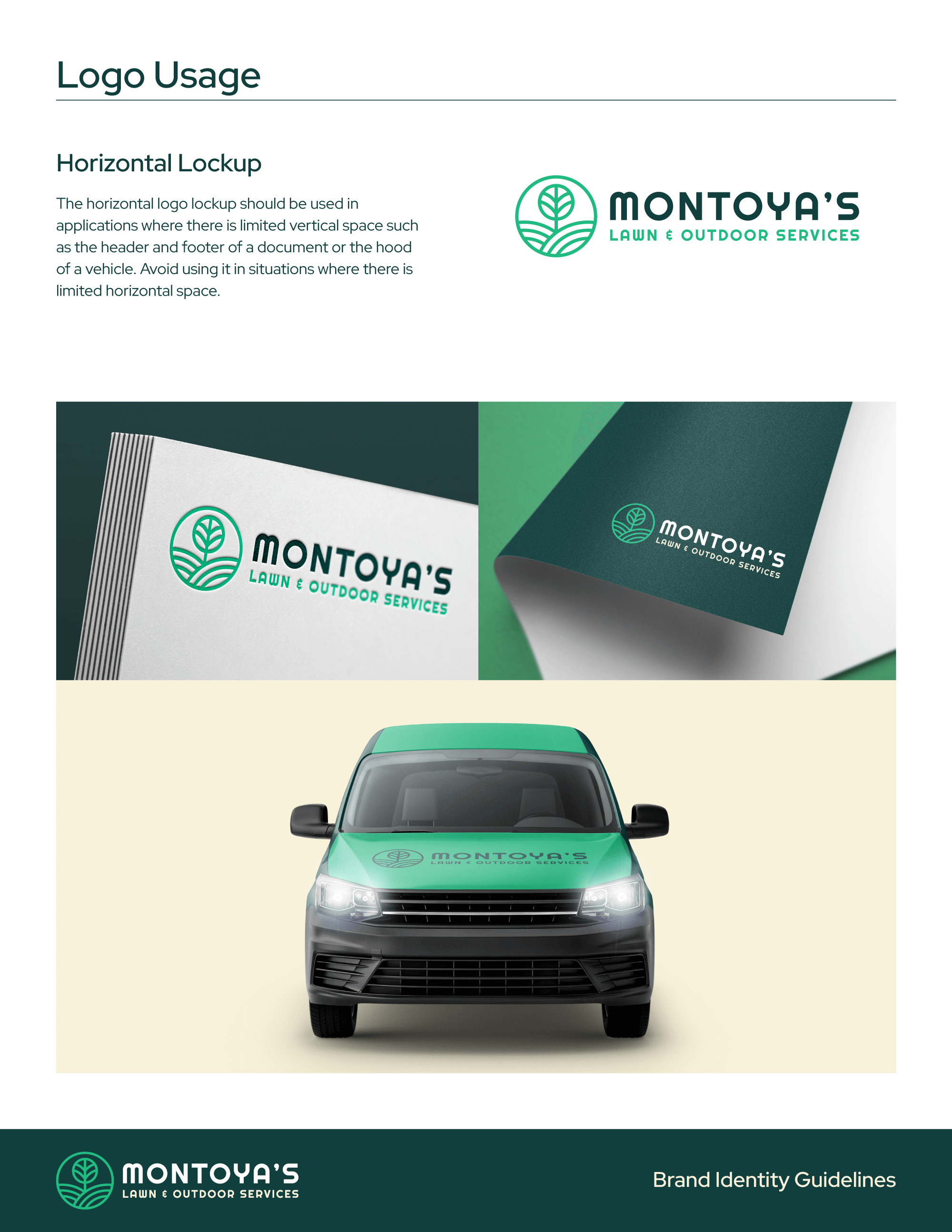
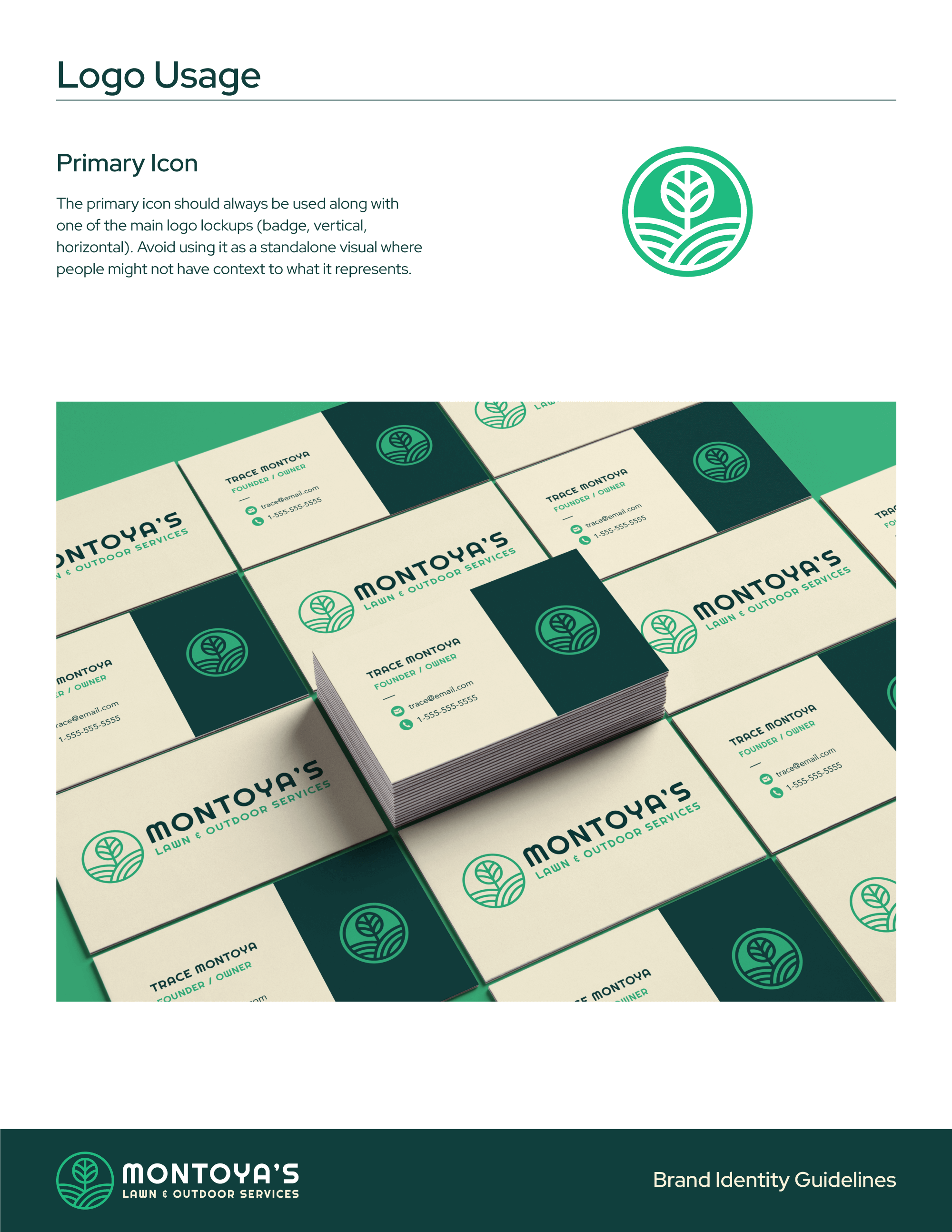
By developing a full brand identity, including color schemes, typography, and imagery that reflected the company's commitment to professionalism, eco-friendly practices, and customer focus, we established a visual language that could be applied consistently across all touchpoints. This gave the company a cohesive look, not only for their logo but also for marketing materials, uniforms, vehicle wraps, and even social media, ensuring that every piece of communication aligned with their brand message. The goal was to create a lasting impression that reinforced trust and reliability, far beyond what a simple logo could achieve.

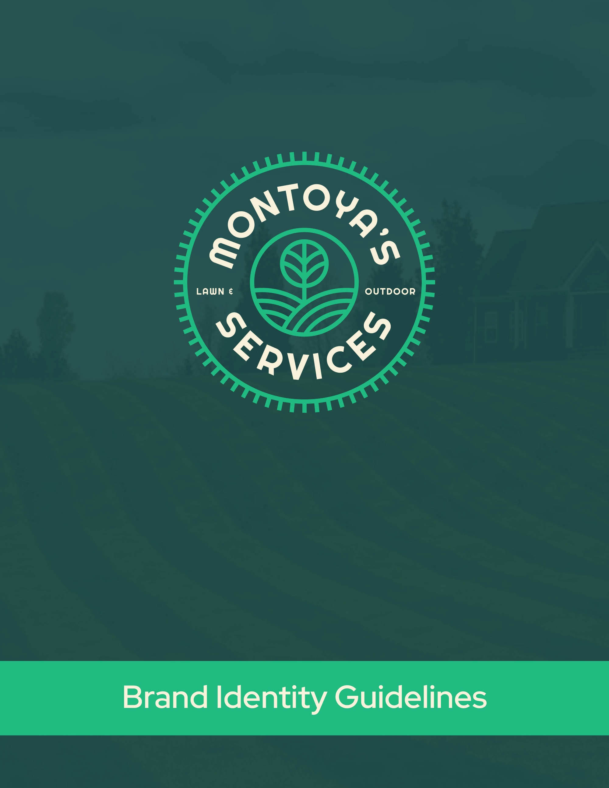
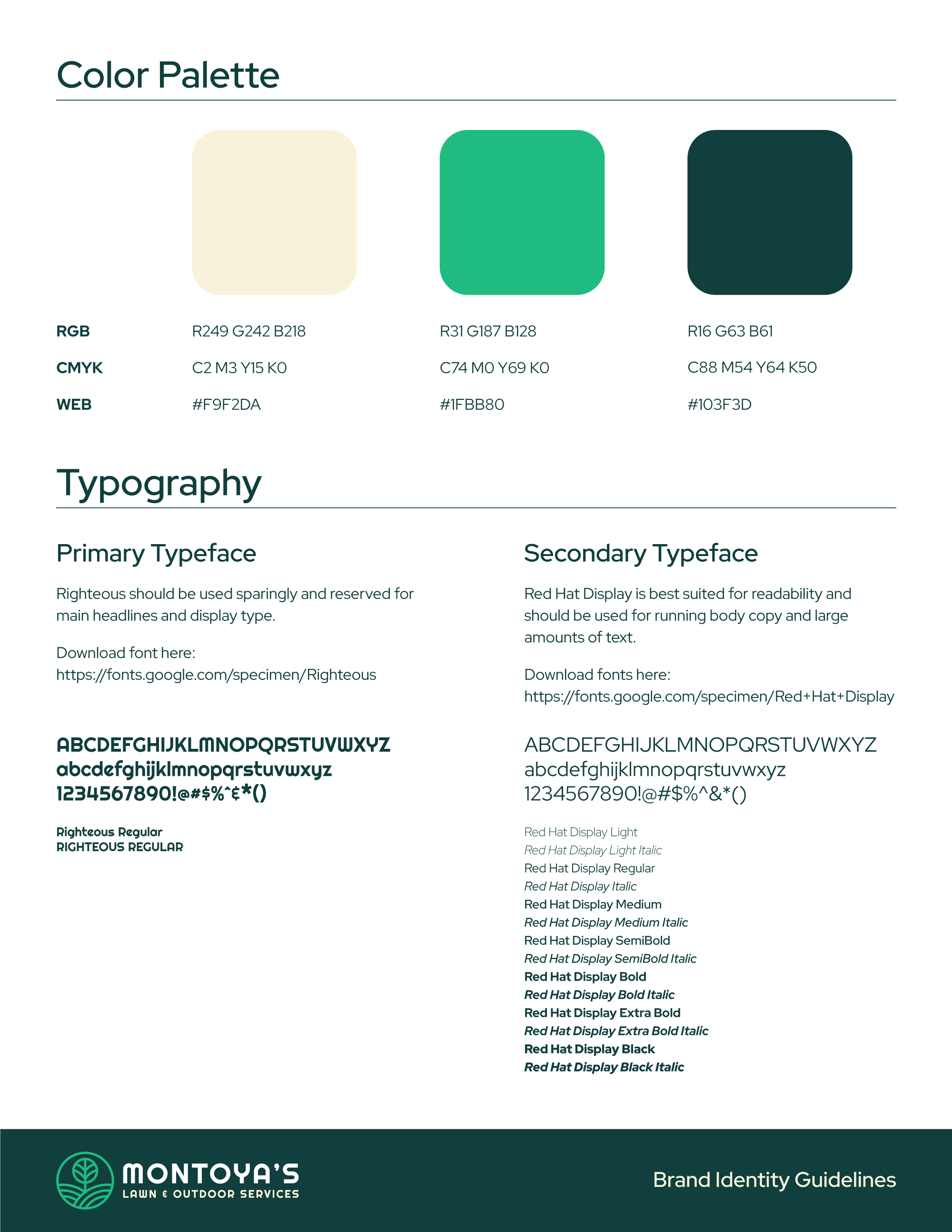
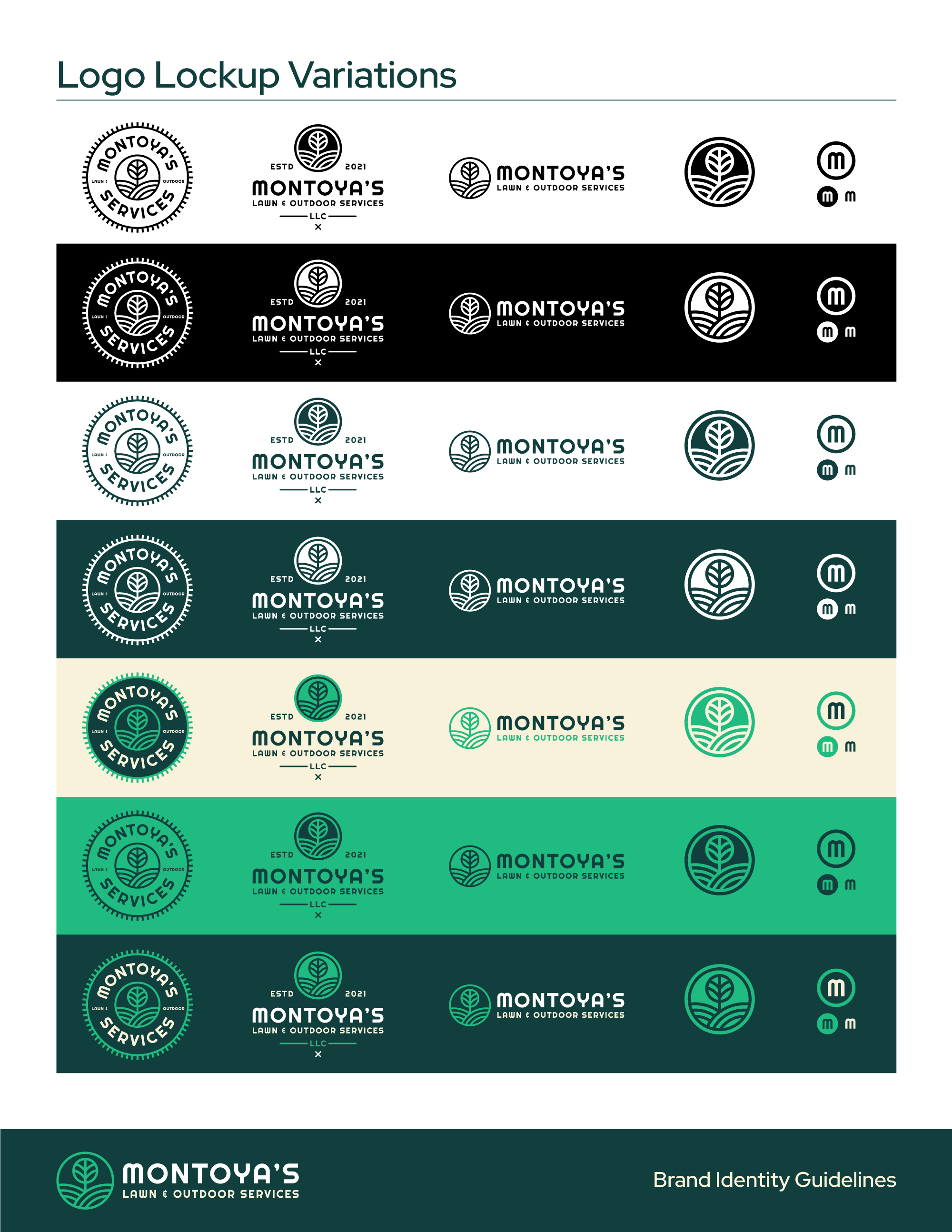
Brand Guidelines
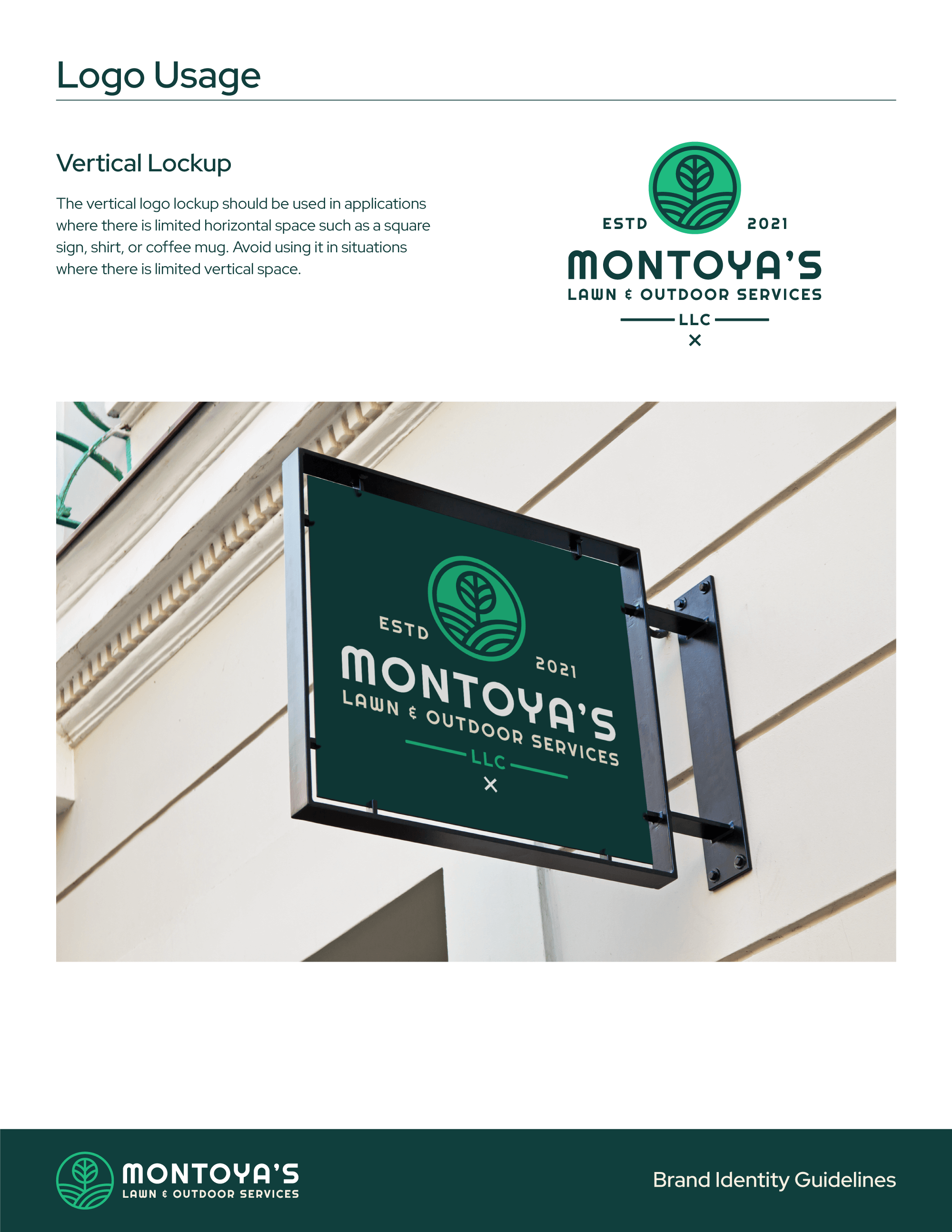
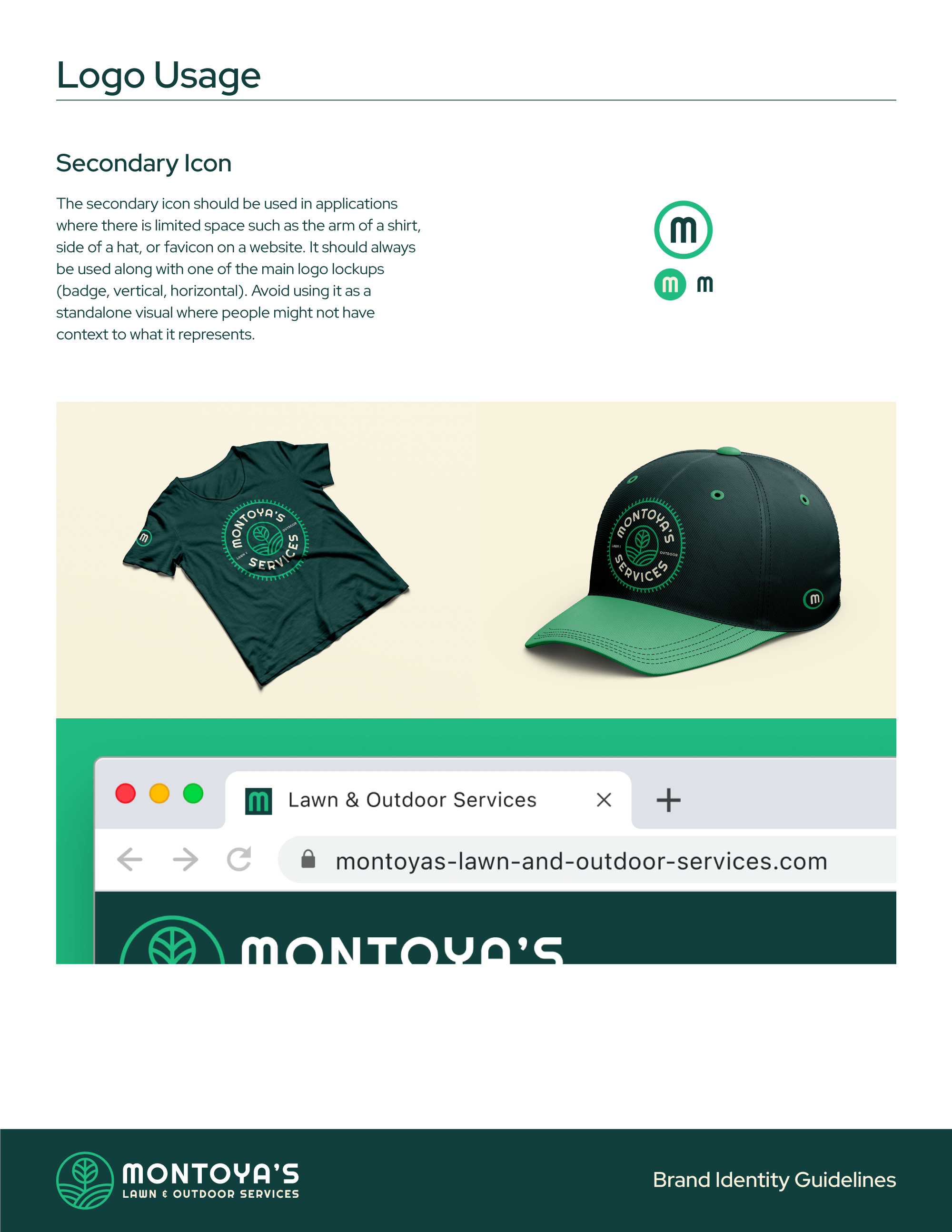
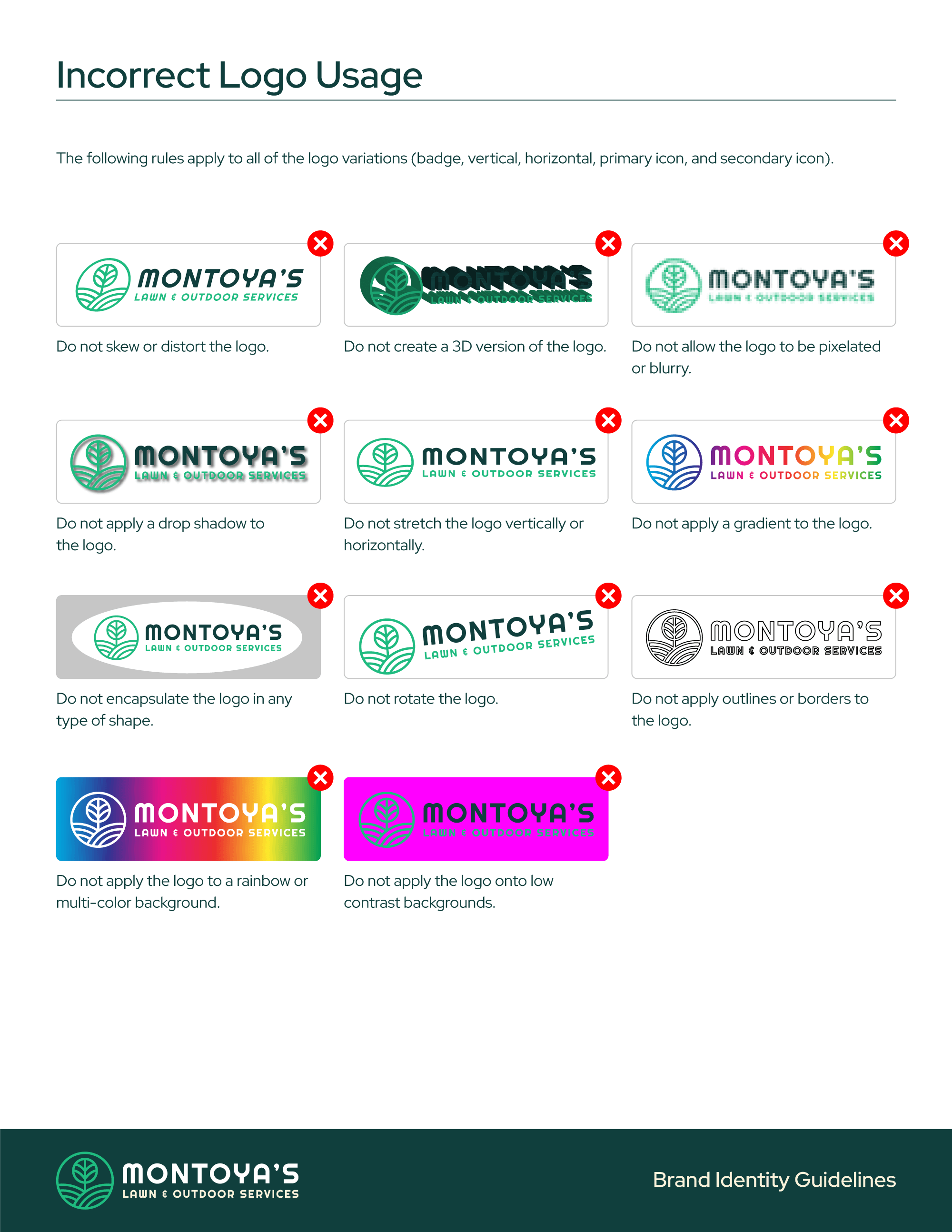
I provided the client with comprehensive brand guidelines and visual identity standards to ensure consistency across all their communications. These guidelines are essential for maintaining a cohesive look and feel, helping to establish a recognizable and trustworthy brand presence. By outlining proper logo usage, color palettes, typography, and visual elements, the guidelines enable the client and their team to present a unified image, whether on social media, marketing materials, or internal documents. This consistency not only reinforces the brand’s identity but also builds trust with their audience by delivering a professional and polished experience at every touchpoint.

Other Projects
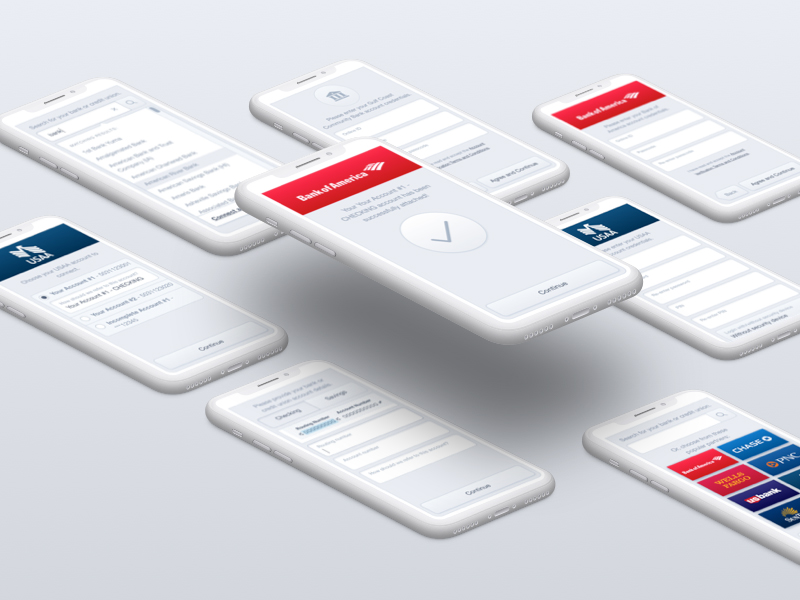
Omnia PRO Advanced Mapping ToolsUX / UI Design
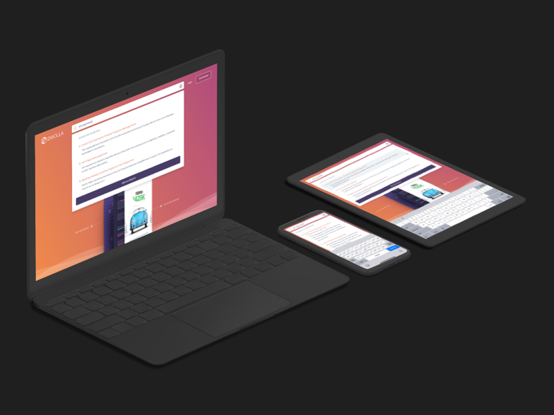
Dwolla Developer Portal RedesignUX / UI Design
Global Search on Dwolla.comUX / UI Design
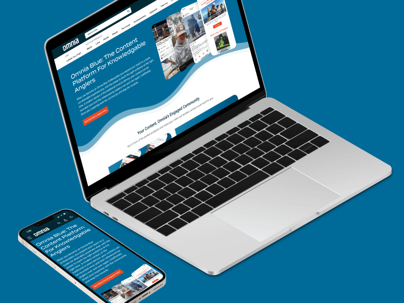
Omnia Blue Landing PageWeb Design
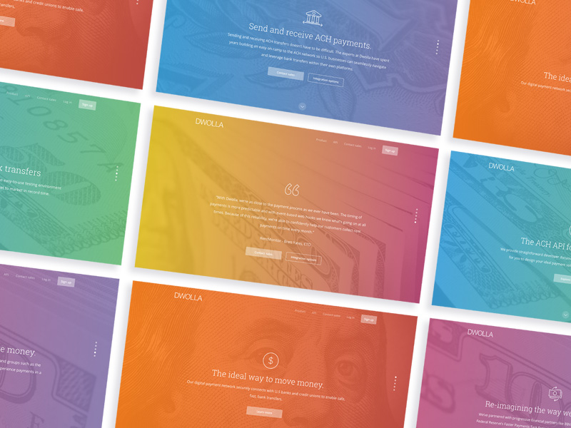
Dwolla Marketing Site RedesignWeb Design
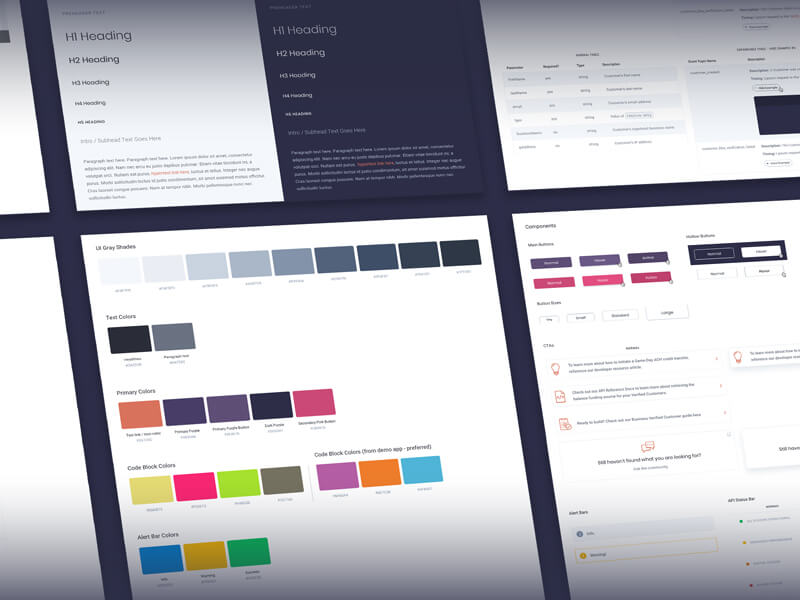
Dwolla Identity Design SystemBranding
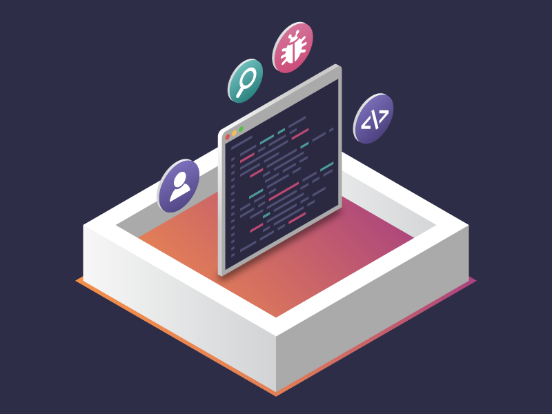
FinTech Product PrototypeUX / UI Design

Dwolla Core ValuesBranding
Landing Page GraphicIllustration
Red Benny Font SpecimenBranding / Typography
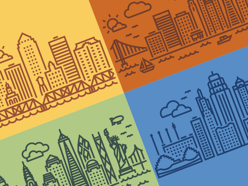
Office City Location IllustrationsIllustration
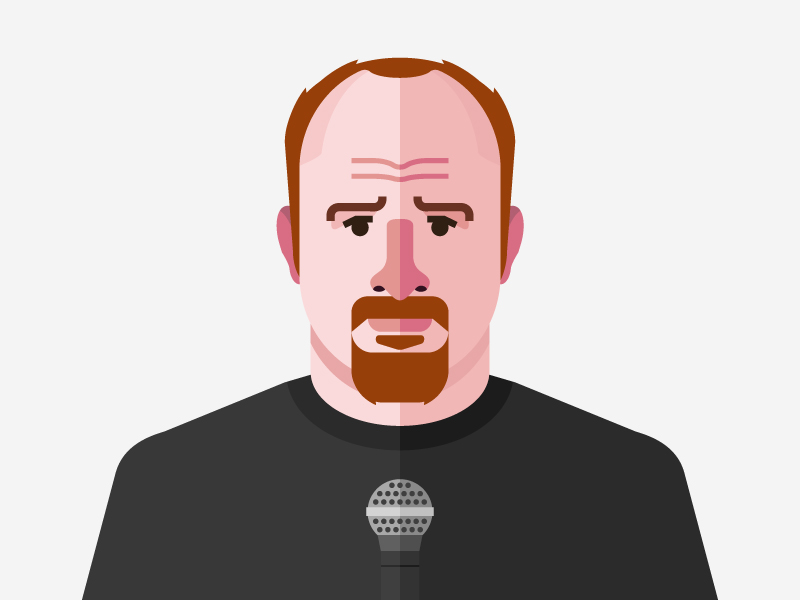
Louis C.K.Illustration
Flat Finance IconsIllustration
Democrat Republican LogoIllustration

Isometric IllustrationsIllustration
Flat Audience IconsIllustration
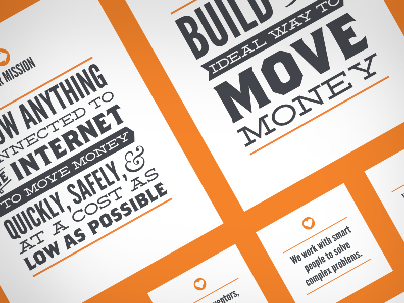
Dwolla Mission, Visions & ValuesTypography / Print
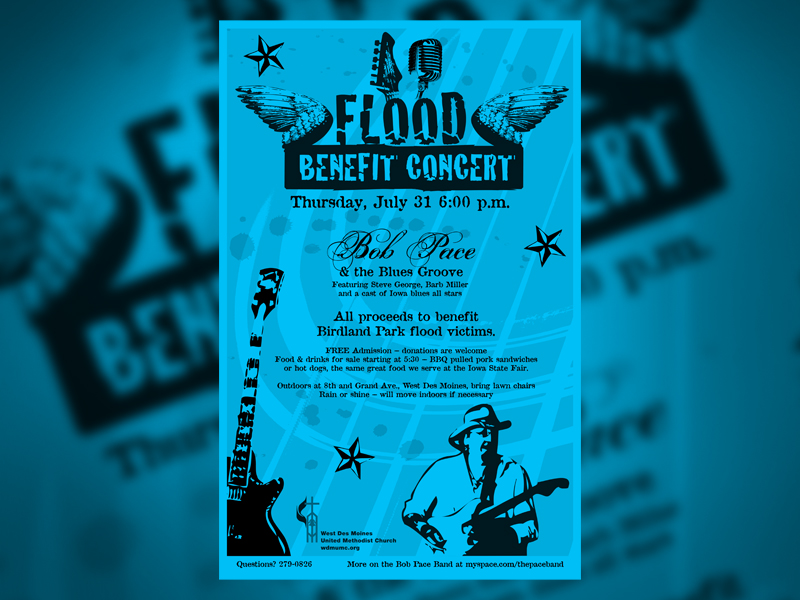
Food Benefit PosterPrint