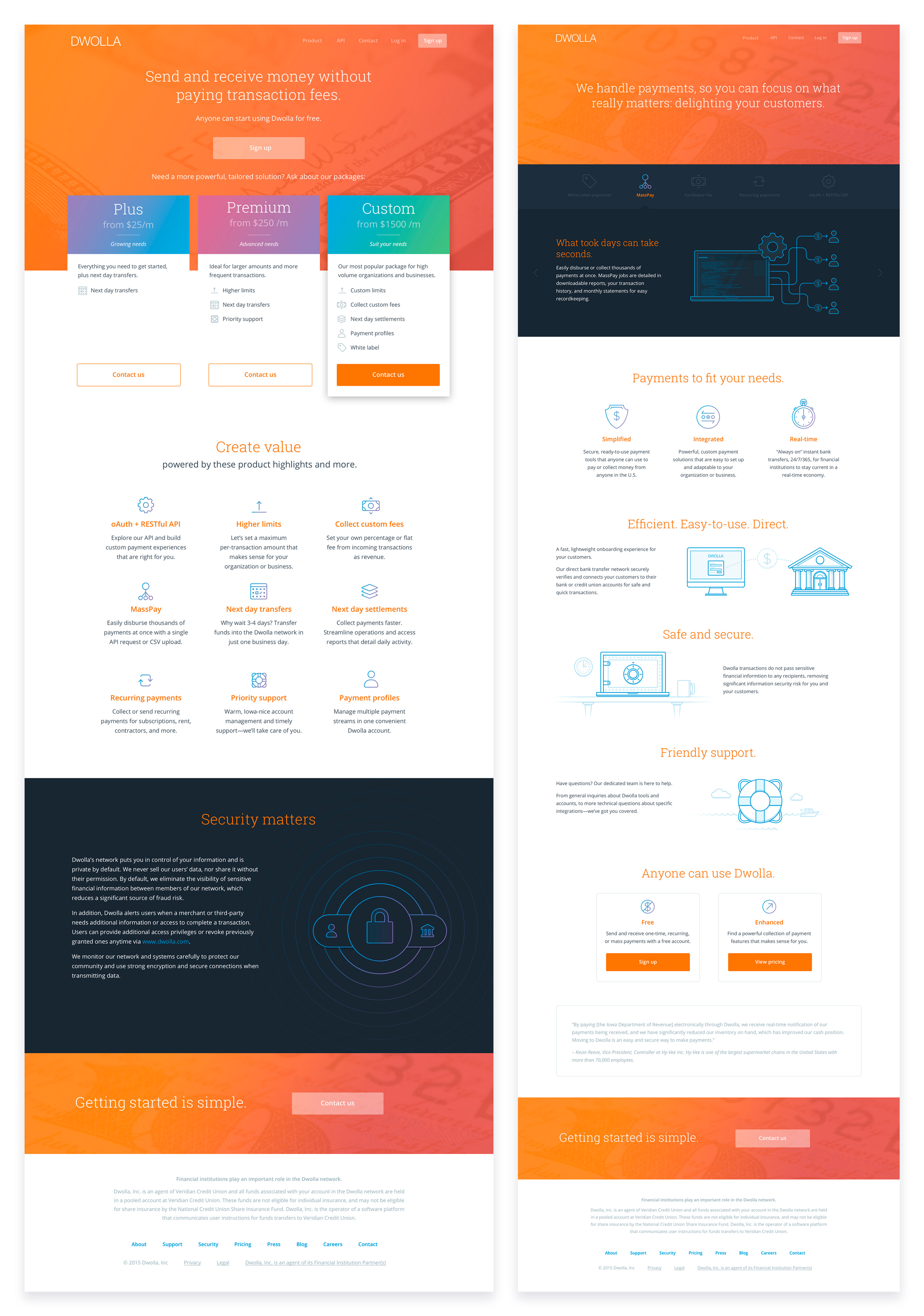
Dwolla Marketing Site Redesign
In early 2016, Dwolla went through a pricing restructure and moved from charging fees based on their customer's transactions to a SaaS or subscription model. This required a redesign of the marketing site, focusing on the most visited pages: Home, Product, and Pricing. The new design significantly updated the site's overall look and feel, taking the brand in a bold, modern, and cutting-edge direction.
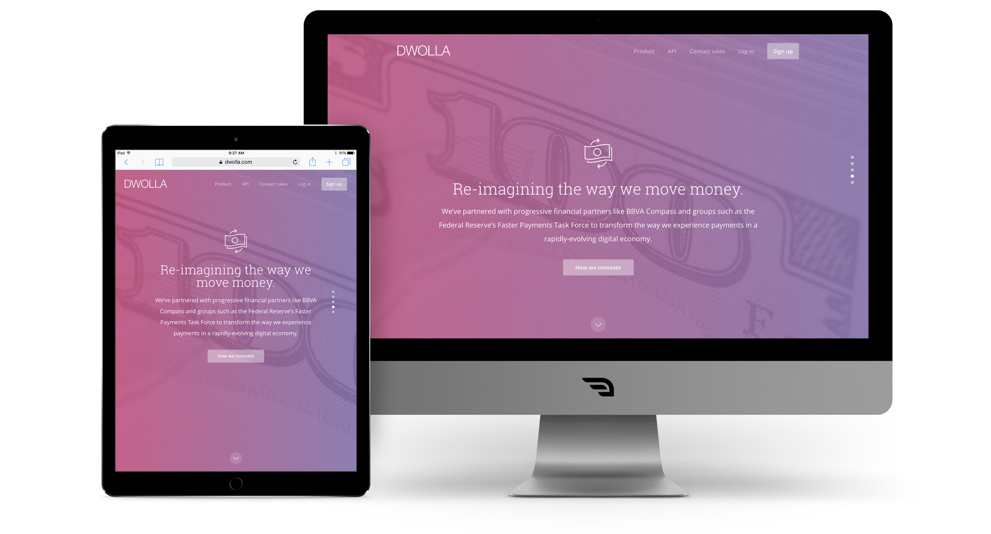
Responsive Design
Each page was designed and developed with responsive functionality to ensure an optimal experience across various devices and screen sizes.
Graphic Illustrations
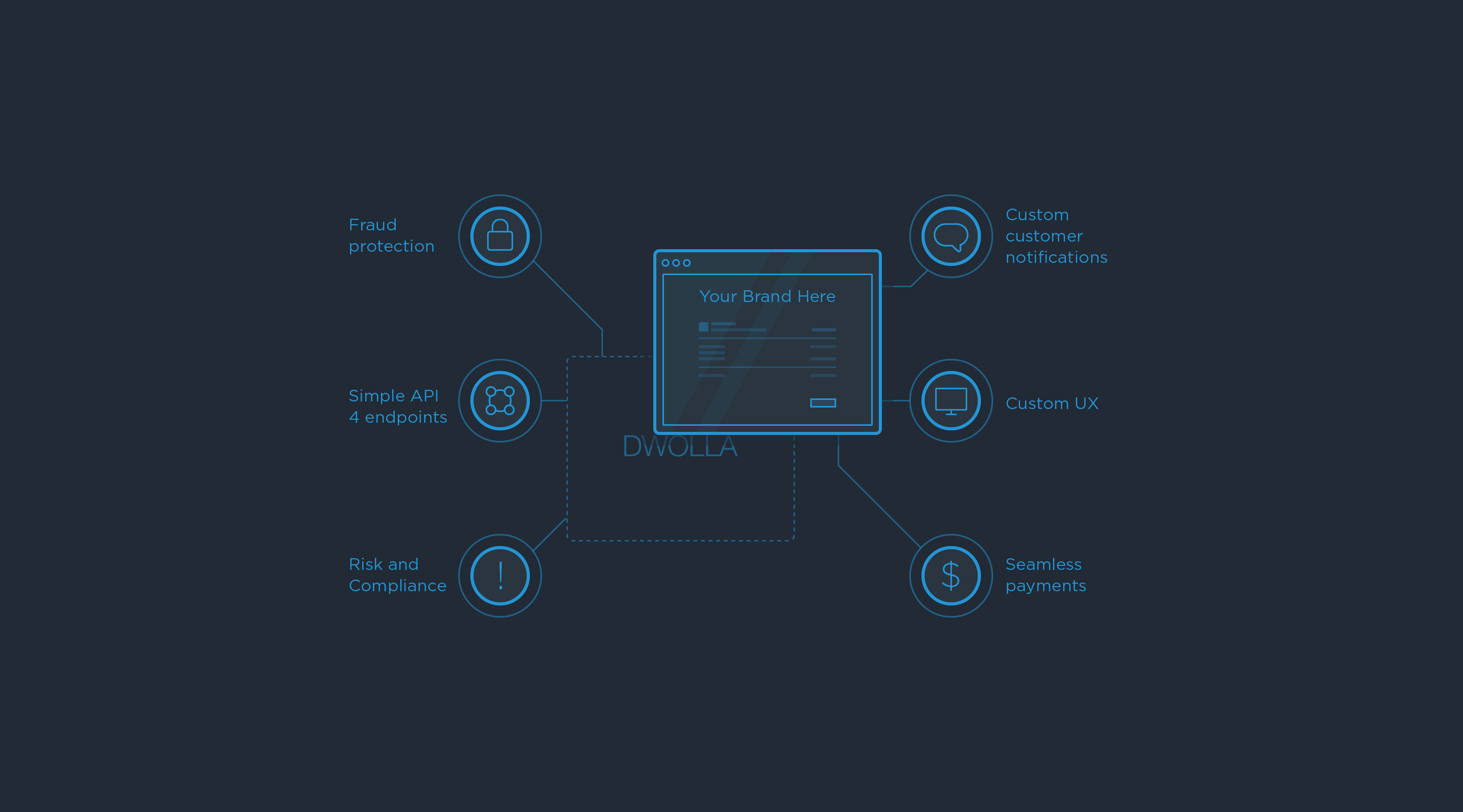
A closer look at some of the line illustrations on the Product page.


Other Projects

Omnia PRO Advanced Mapping ToolsUX / UI Design
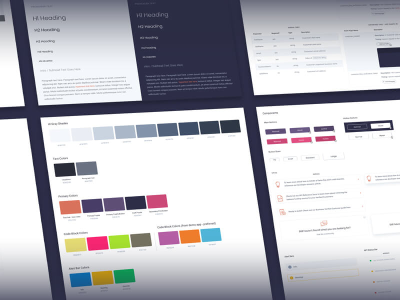
Dwolla Developer Portal RedesignUX / UI Design
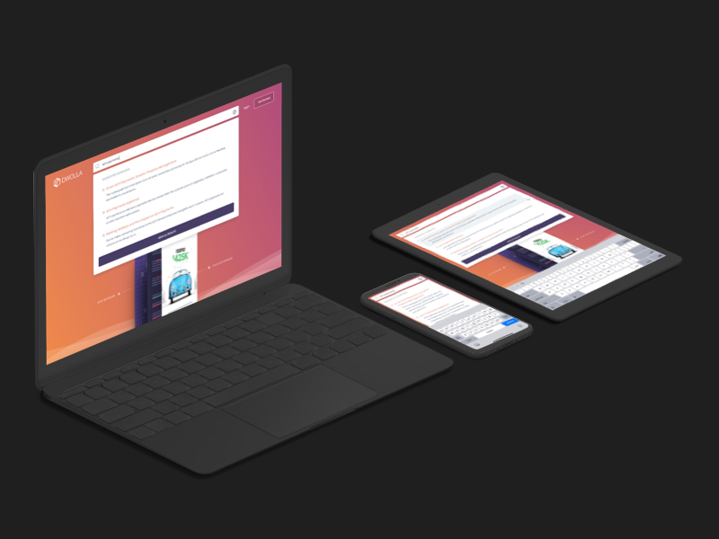
Global Search on Dwolla.comUX / UI Design

Omnia Blue Landing PageWeb Design

Dwolla Identity Design SystemBranding

Montoya Lawn & Outdoor ServicesBranding

FinTech Product PrototypeUX / UI Design

Dwolla Core ValuesBranding

Landing Page GraphicIllustration

Red Benny Font SpecimenBranding / Typography

Office City Location IllustrationsIllustration

Louis C.K.Illustration
Flat Finance IconsIllustration

Democrat Republican LogoIllustration

Isometric IllustrationsIllustration
Flat Audience IconsIllustration

Dwolla Mission, Visions & ValuesTypography / Print

Food Benefit PosterPrint
