Rebranding the Dwolla Identity System
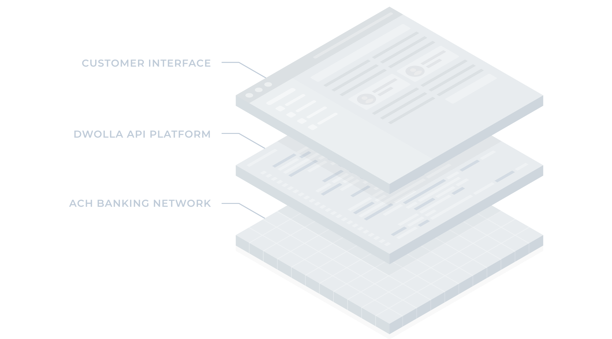
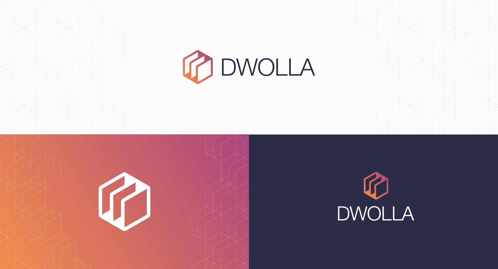
In 2018, I had the opportunity to rebrand Dwolla. Previously focused on P2P payments, the company shifted its business model to center around developing an ACH API based on banking infrastructure. This change in direction necessitated a refreshed brand identity.
My Process
- Competitive Analysis & Research
- Brainstorming / Early Ideation / Sketching
- Exploration and Initial Mockups
- Present Options to Stakeholders
- Iterate on Feedback
- Finalize
Brand Attributes
Key stakeholders collaborated to define specific keywords that would shape the organization's identity. These attributes represent the core characteristics of the brand's personality and would guide the tone and visual style of all future company communications.
- Movement
- Speed
- Reliability
- Network
Shape Exploration
Options Presented to Stakeholders
In Application
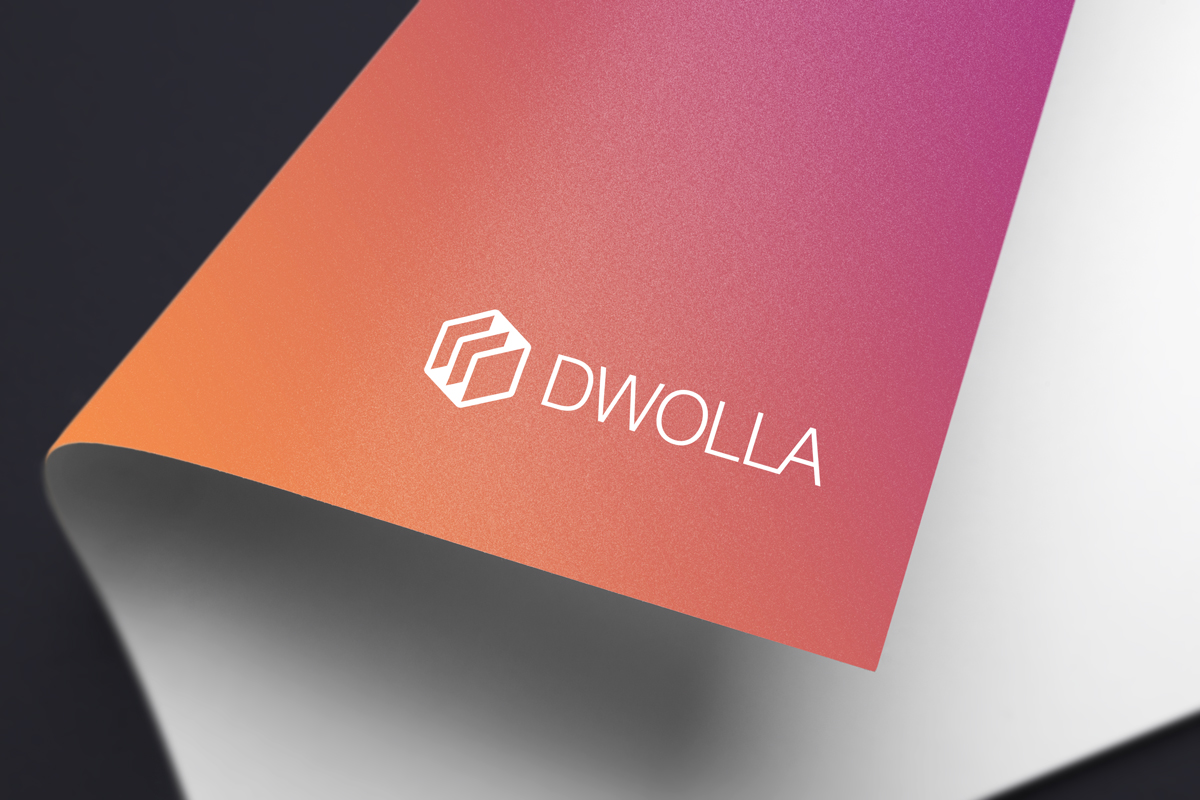
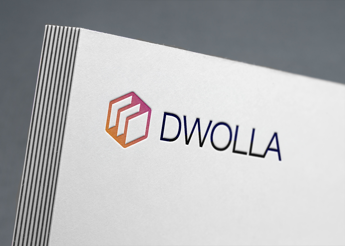
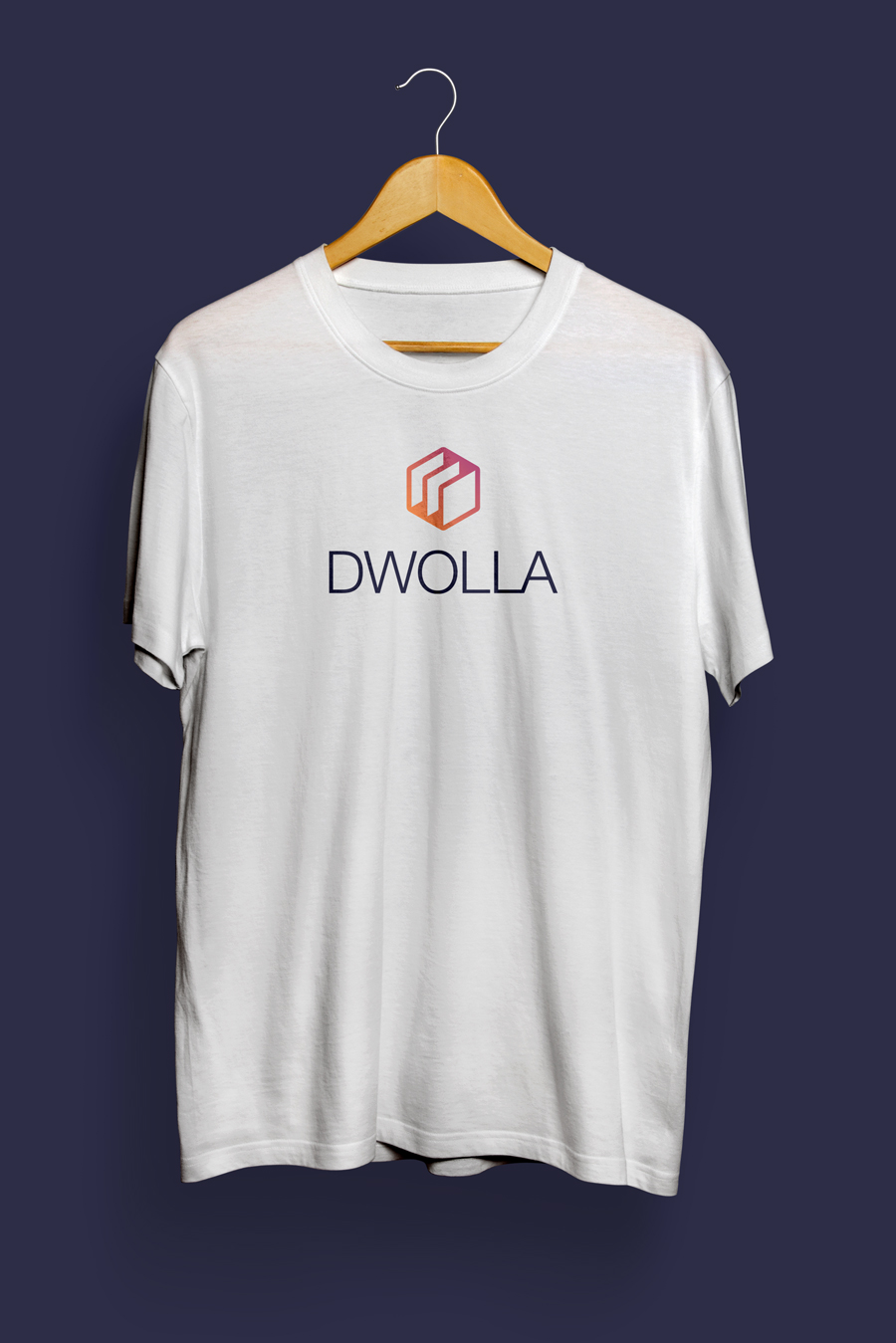
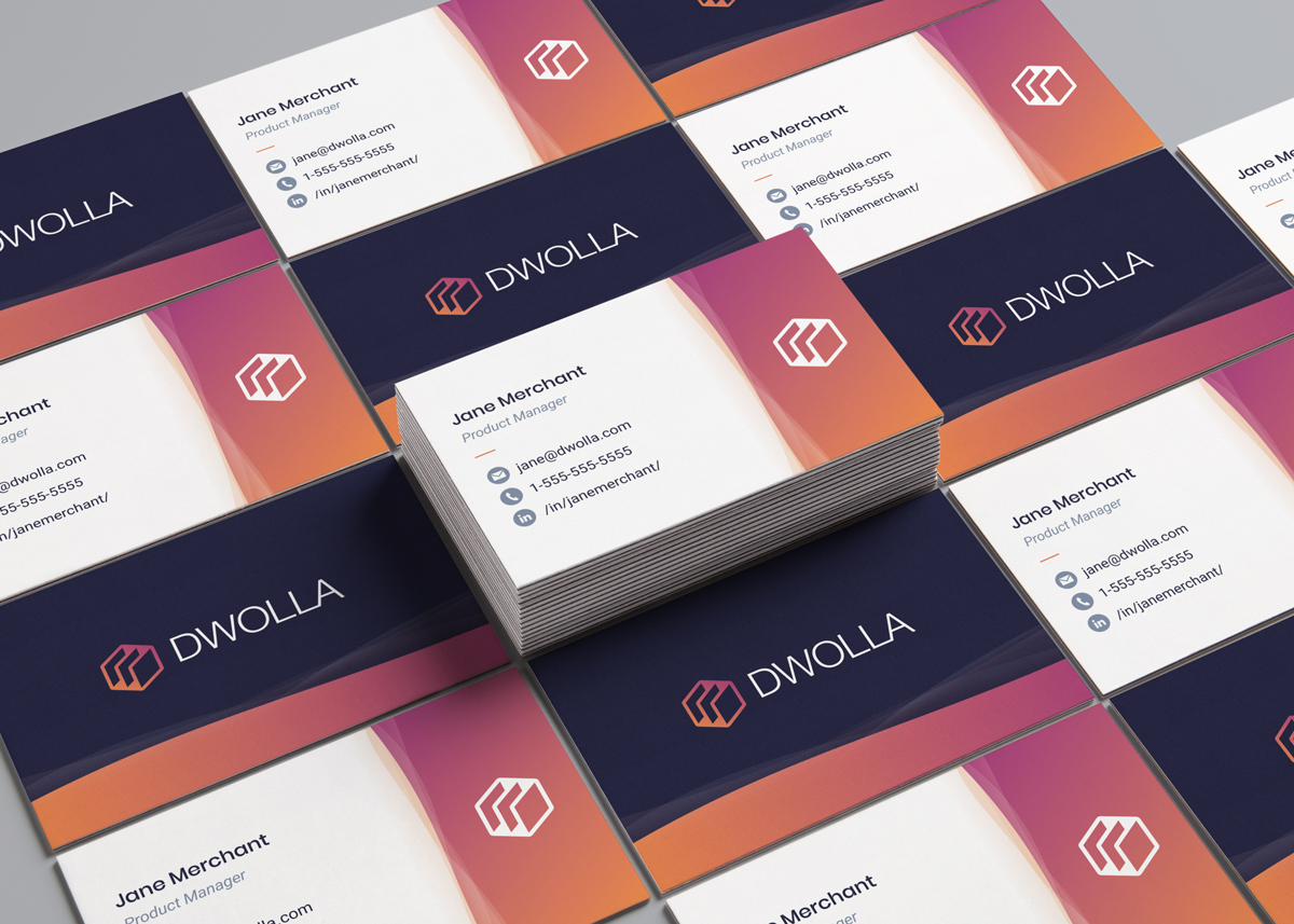
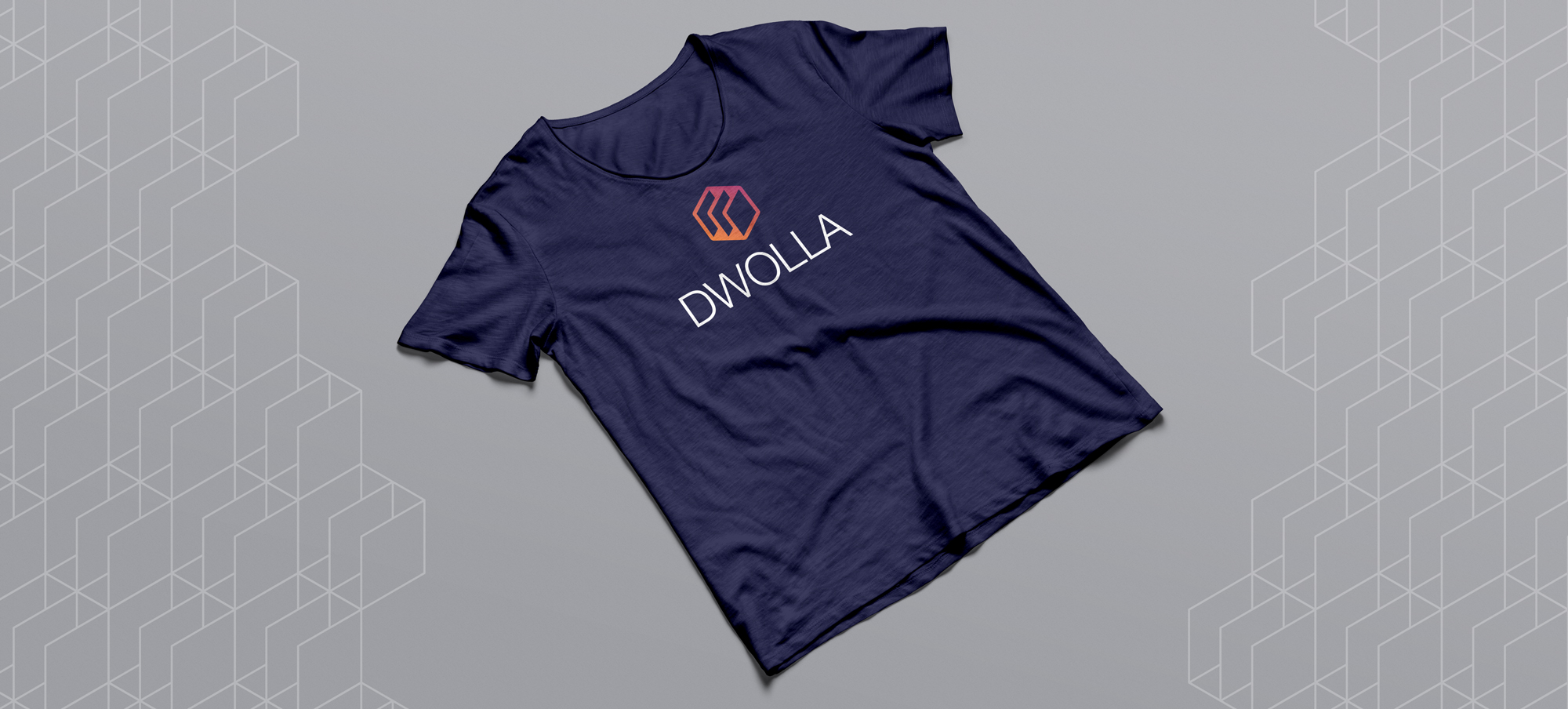
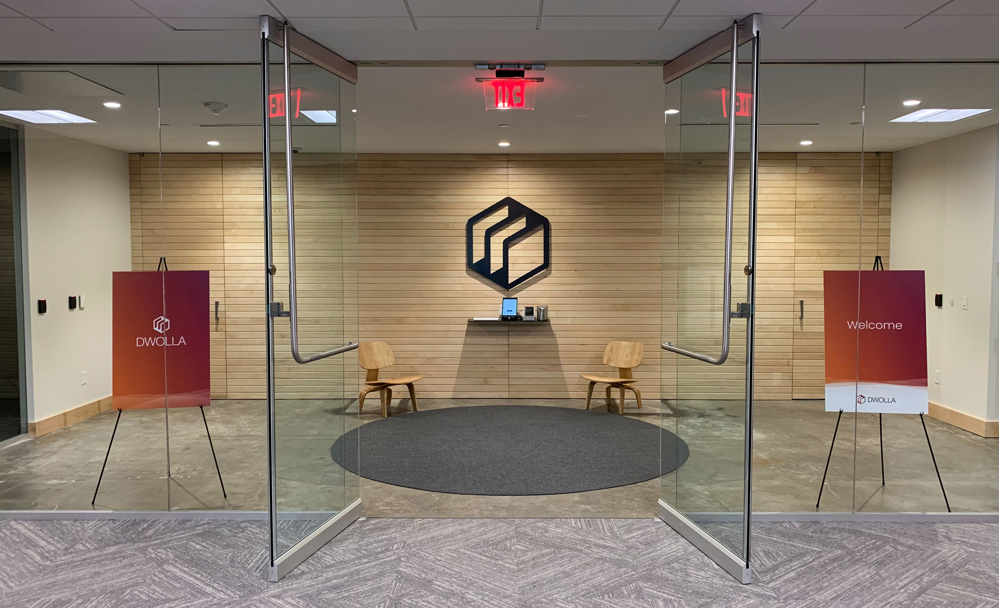
The visual identity system has been implemented across various materials, such as social media profiles, stickers, badges, company presentations, Money 2020 booth graphics, and apparel, among others.
Final Results
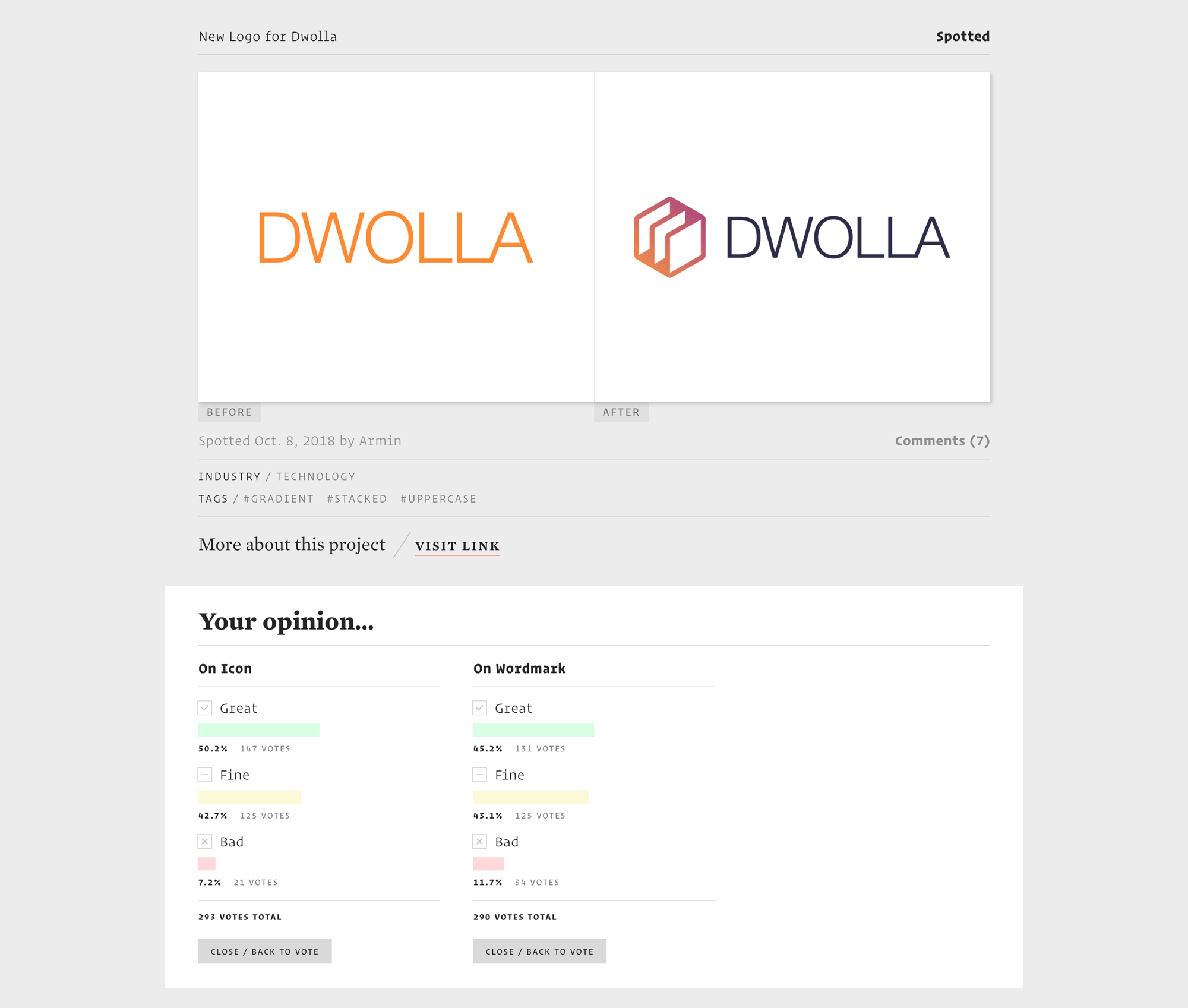
The redesign was featured on the Brand New website, which is a division of UnderConsideration that covers and critiques corporate and brand identity projects. I was pleased to see that the feedback was generally positive, with most people voting "Great" or "Fine."
Brand Guidelines
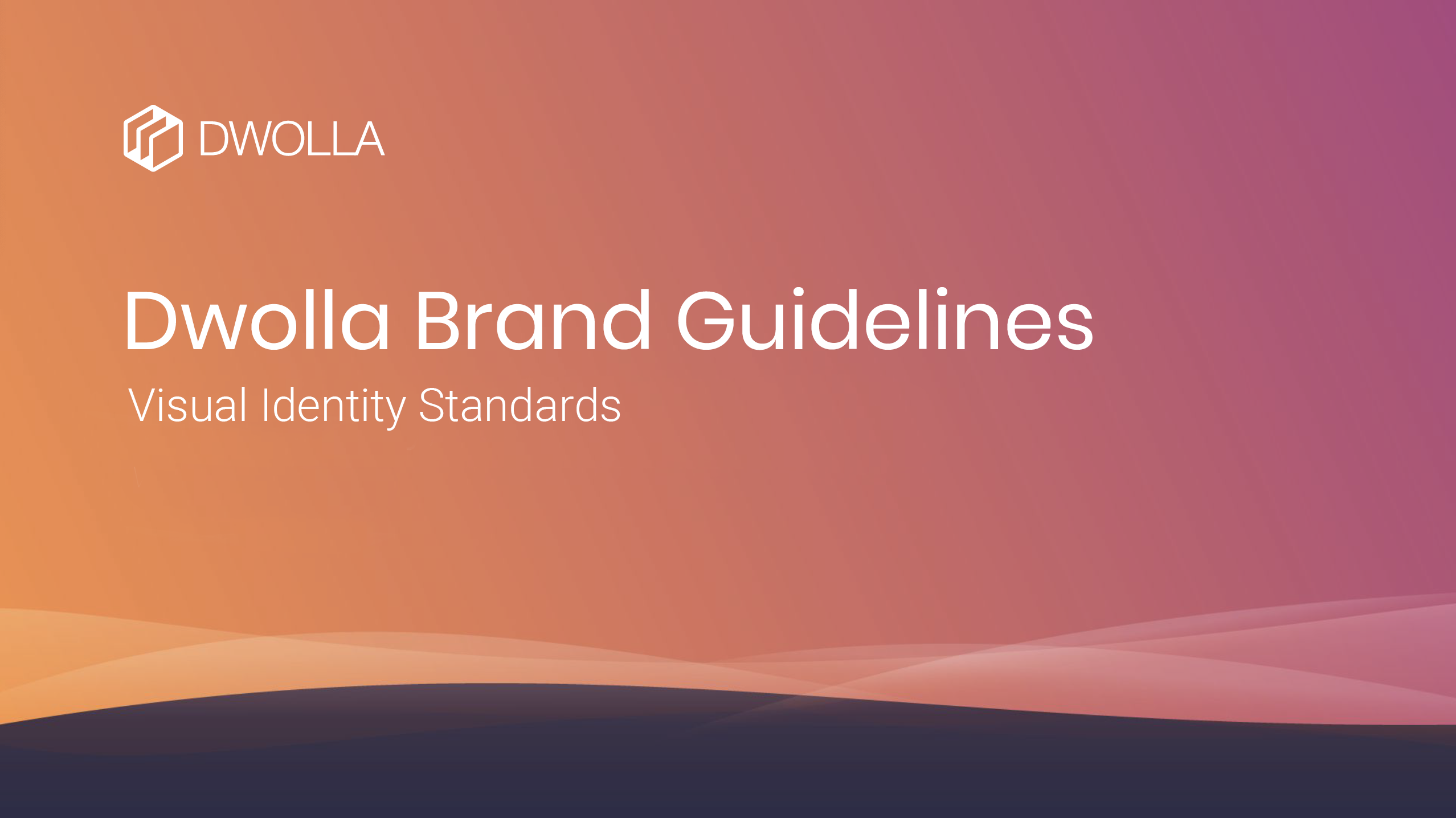
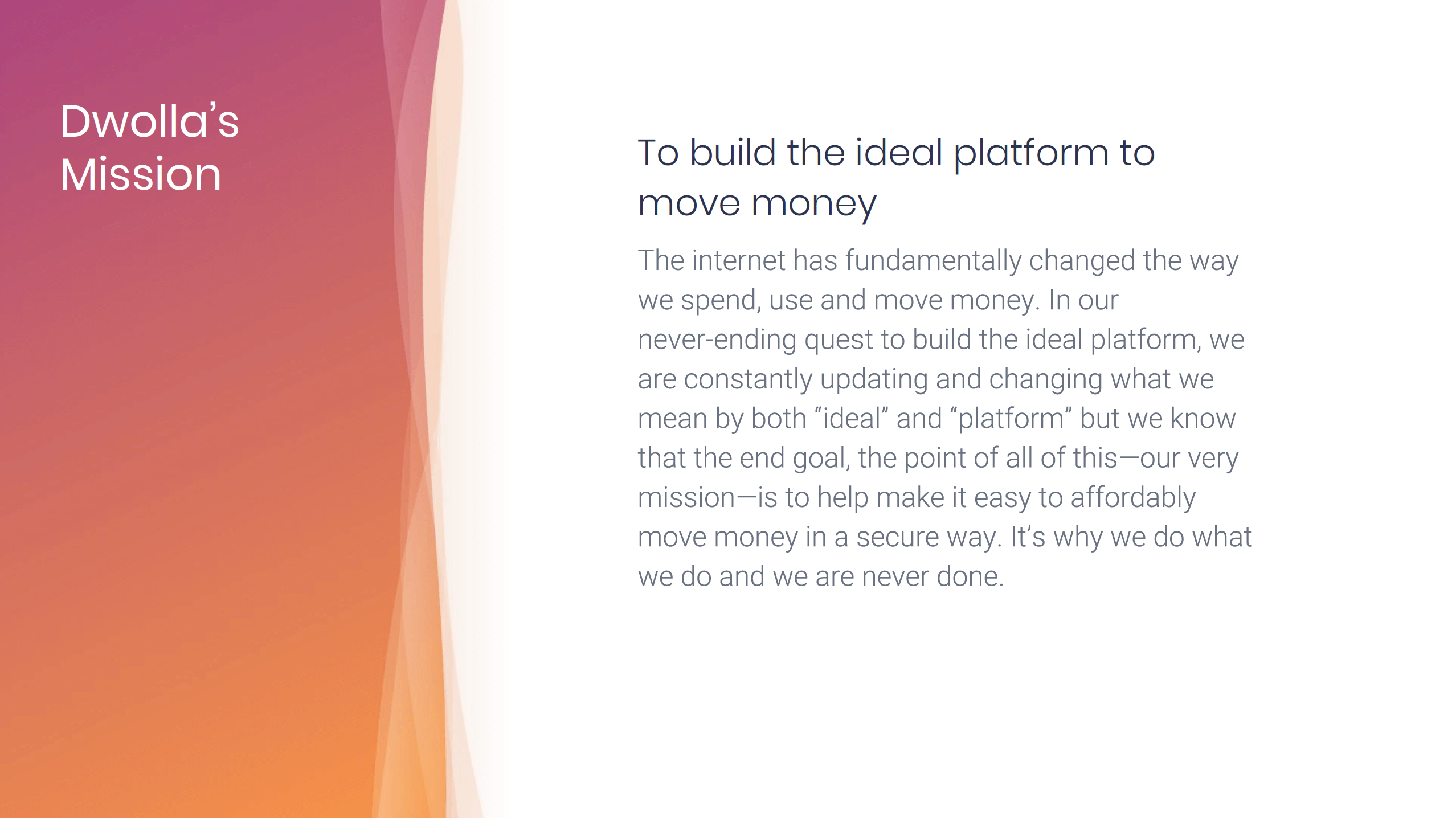
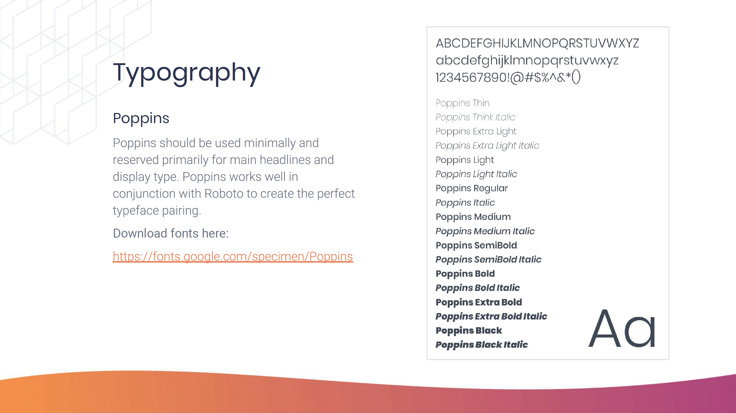
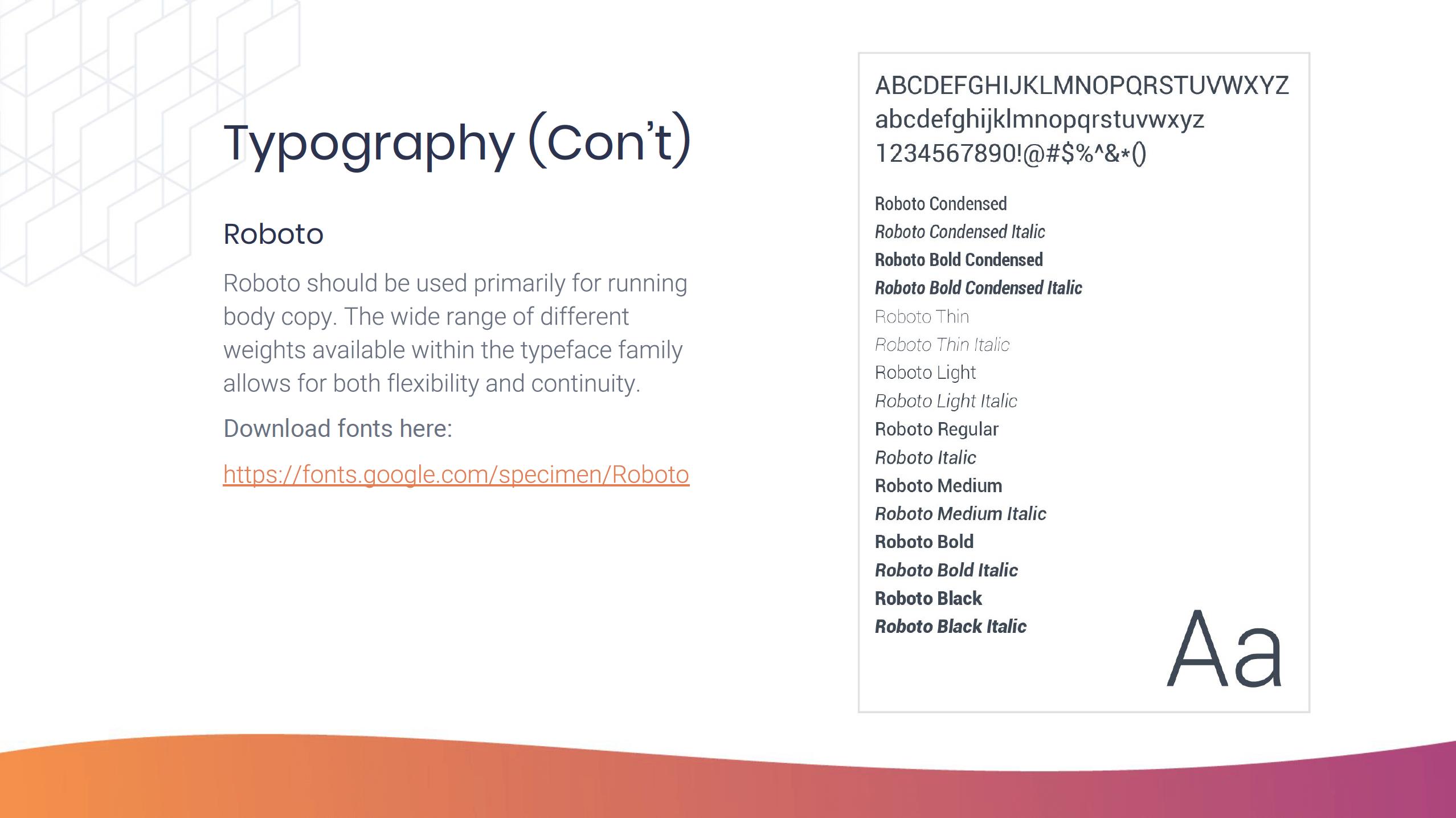
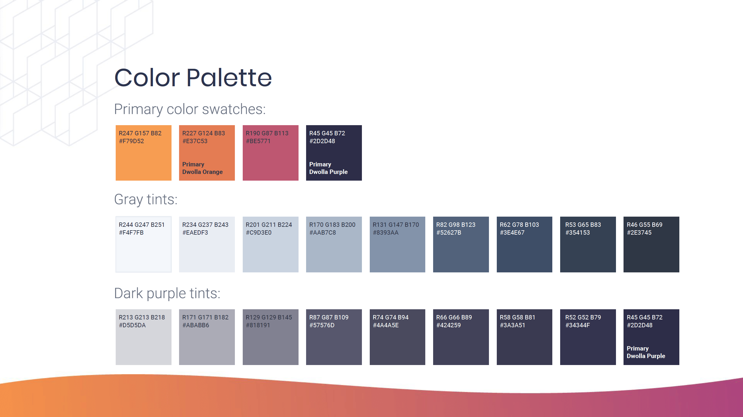
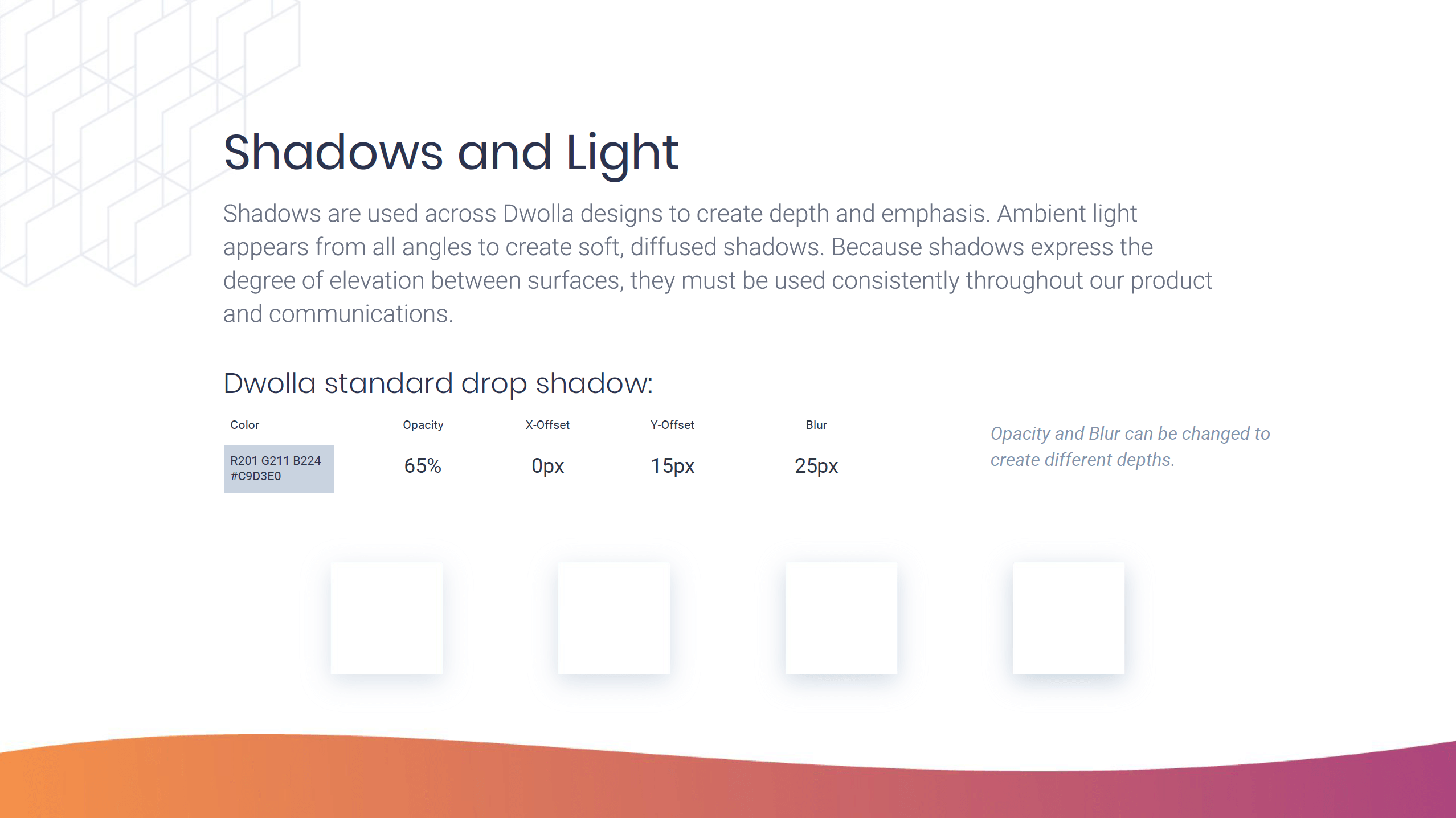
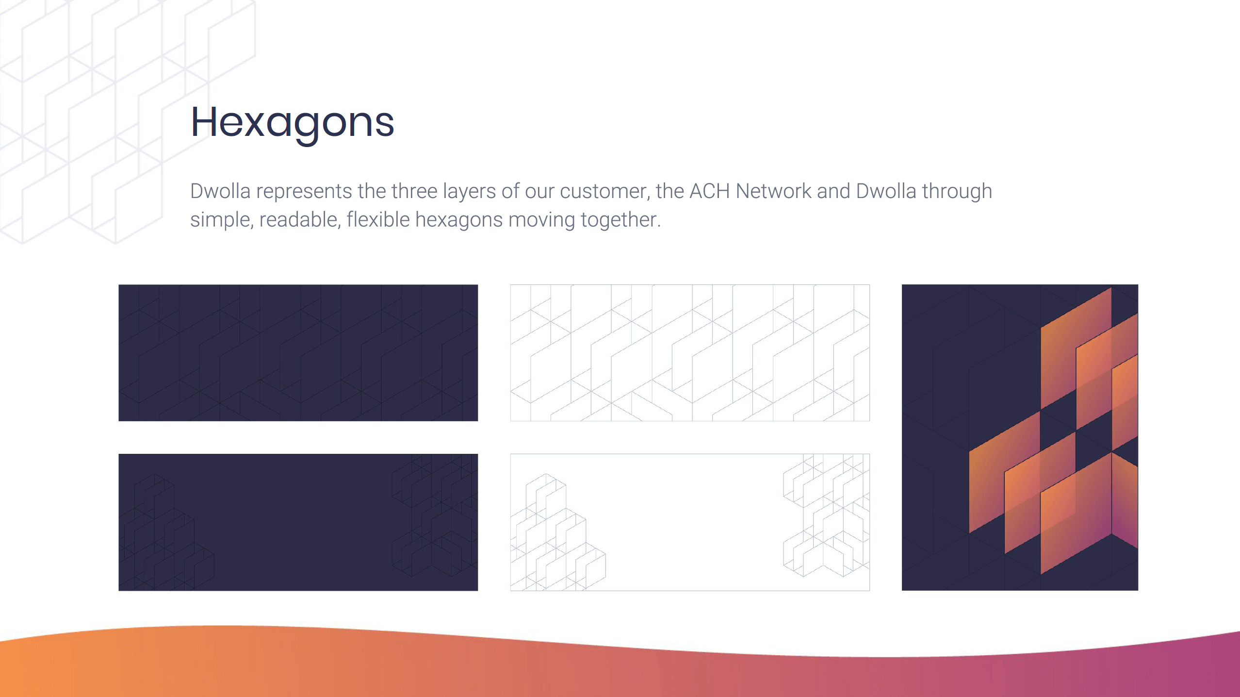
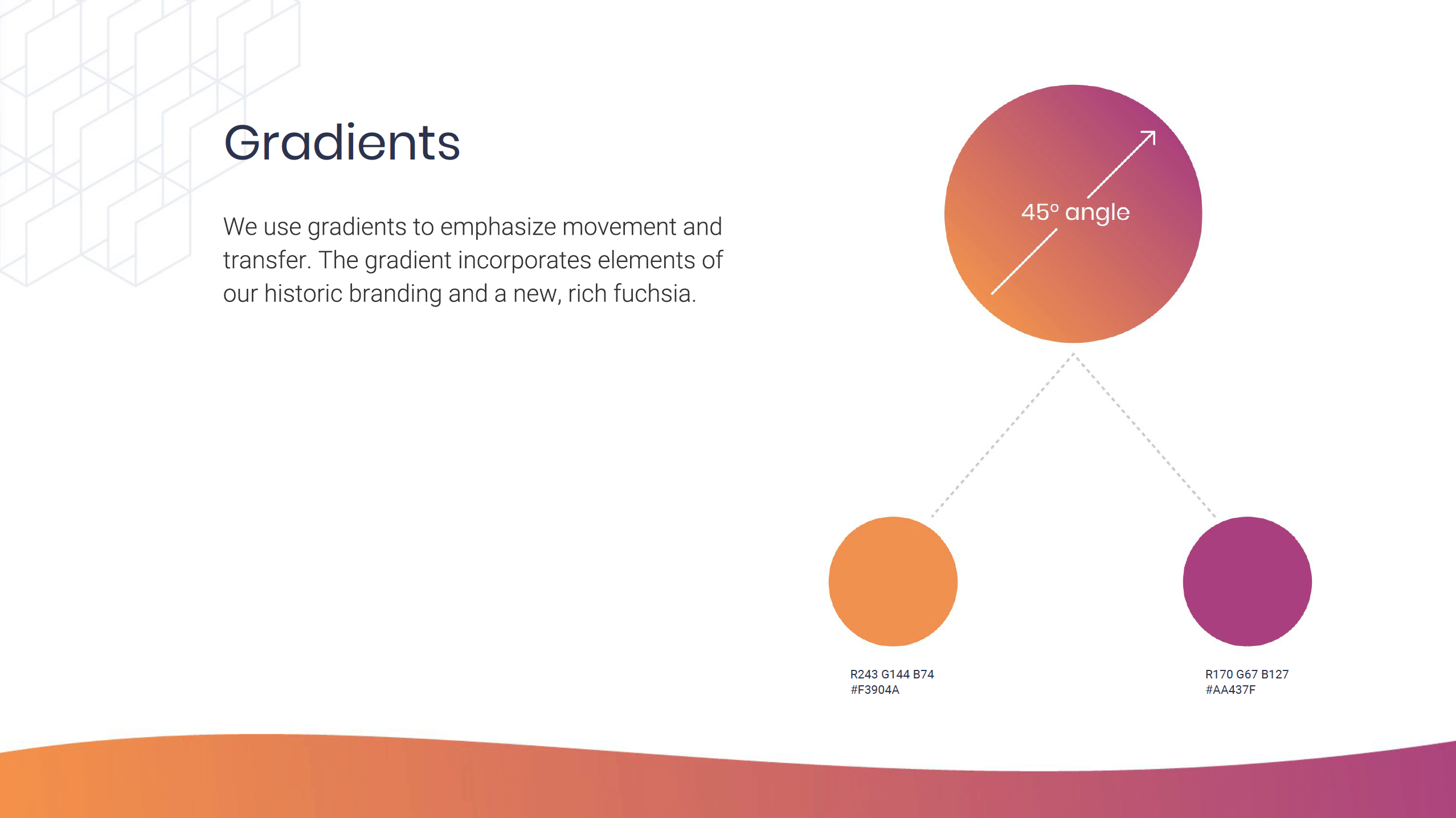
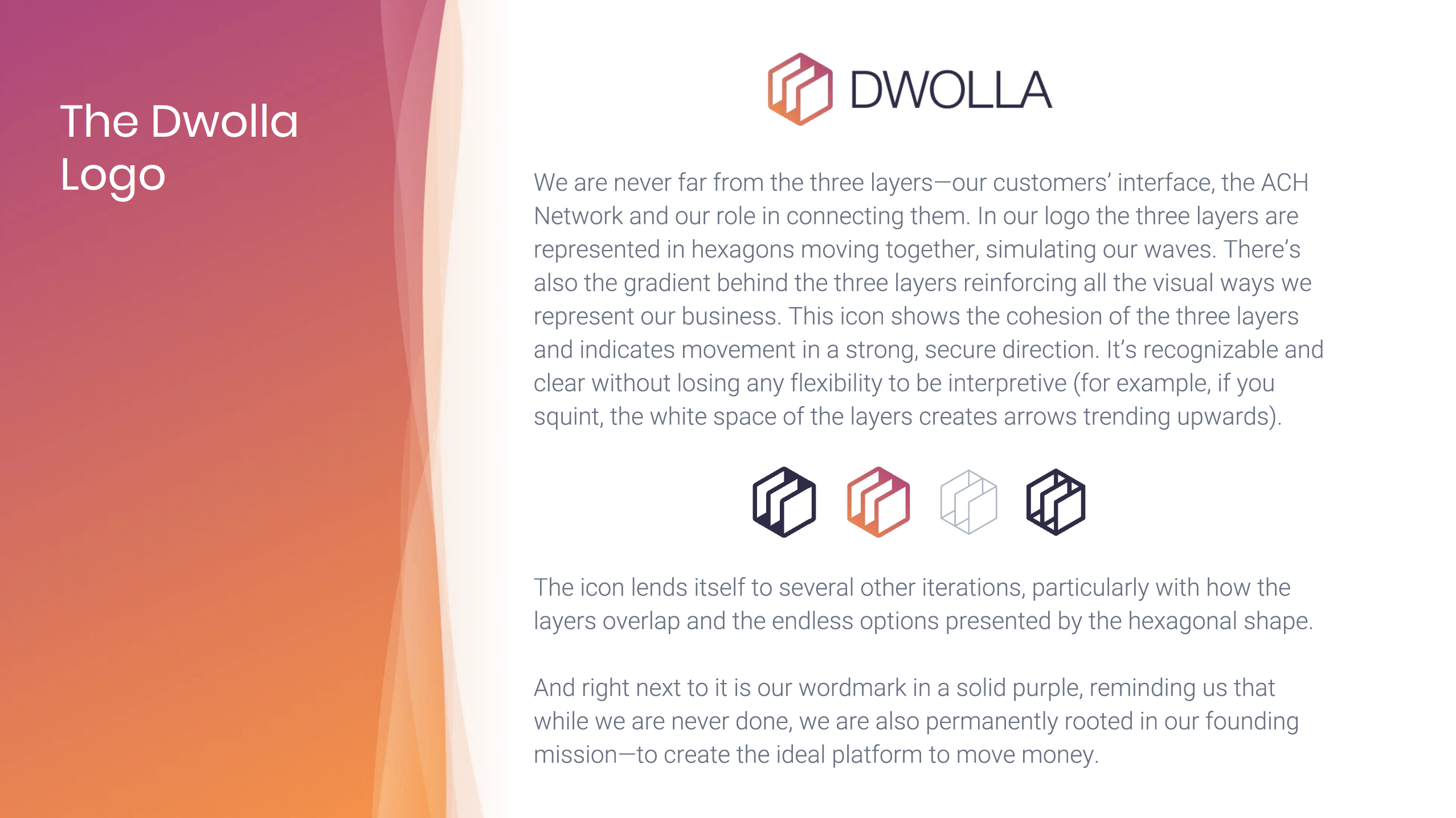
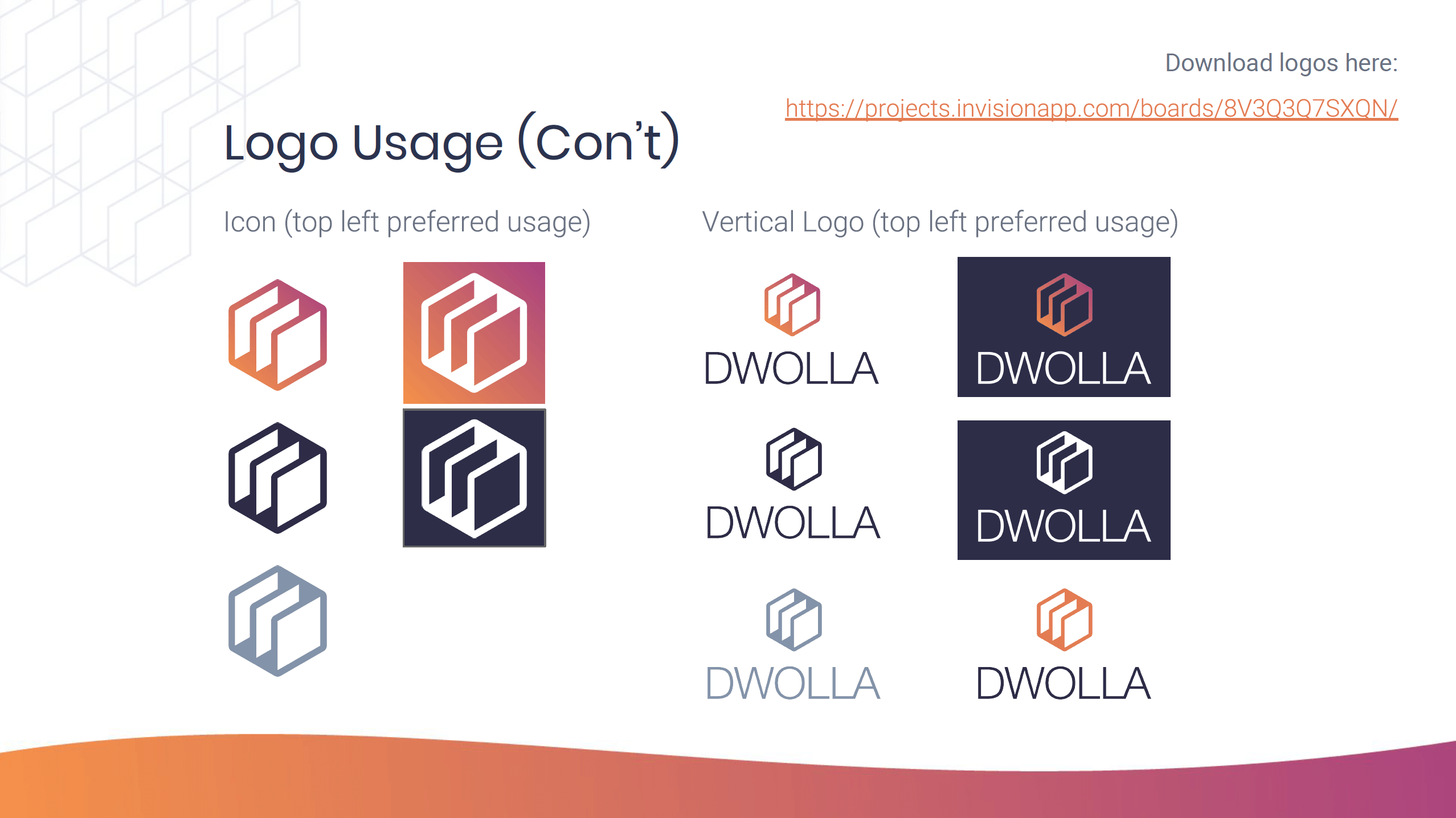
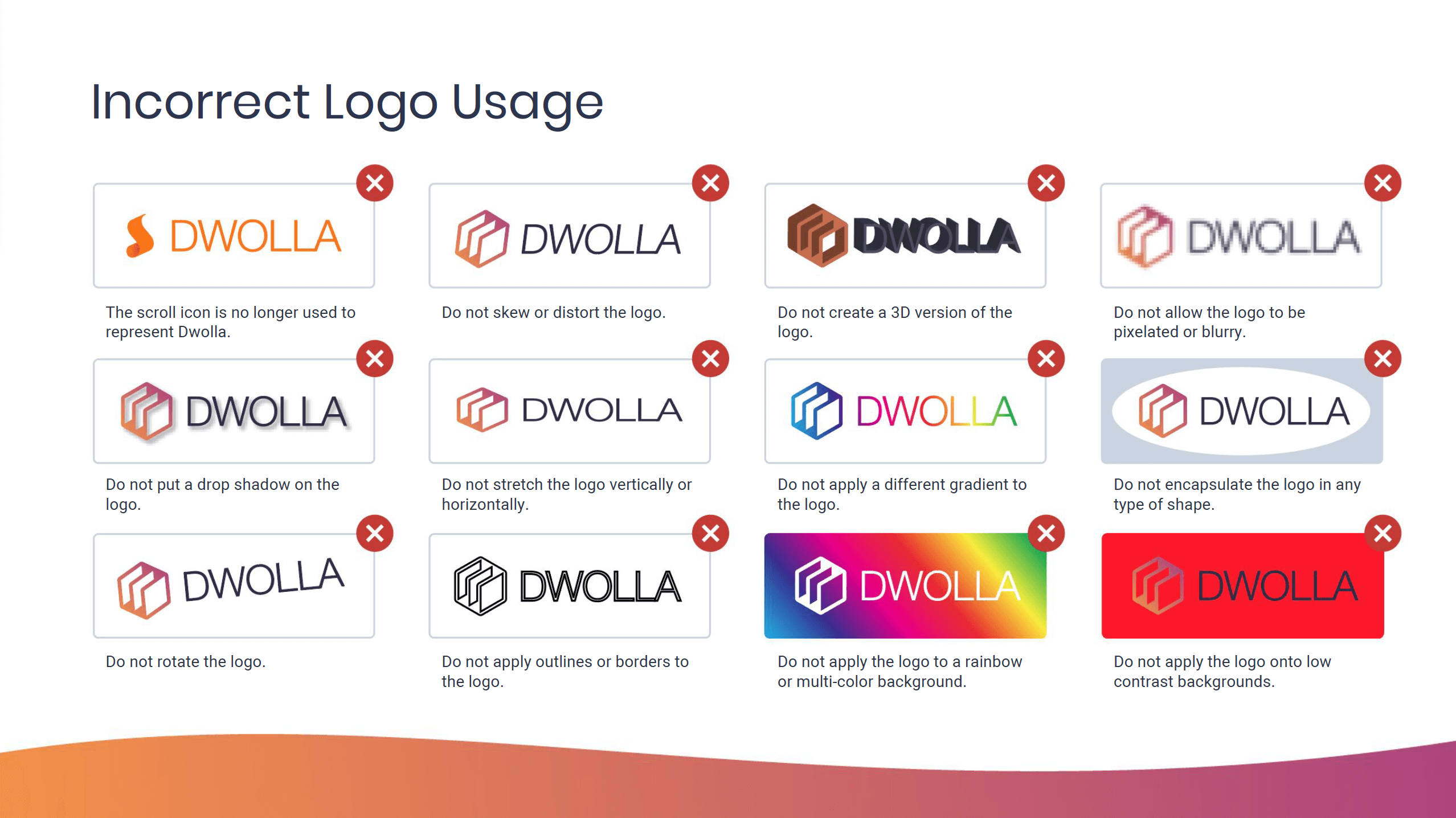
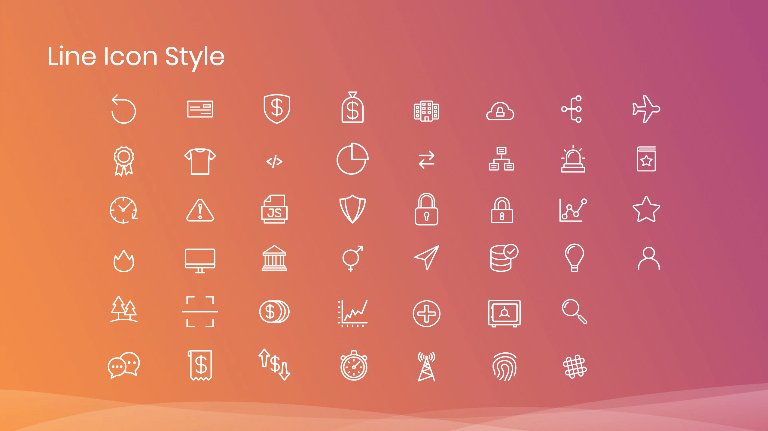
Following the rebrand, I created brand guidelines and distributed them throughout the organization to ensure adherence to brand standards. This led to greater consistency and professionalism across all company assets and communications.


Other Projects

Omnia PRO Advanced Mapping ToolsUX / UI Design
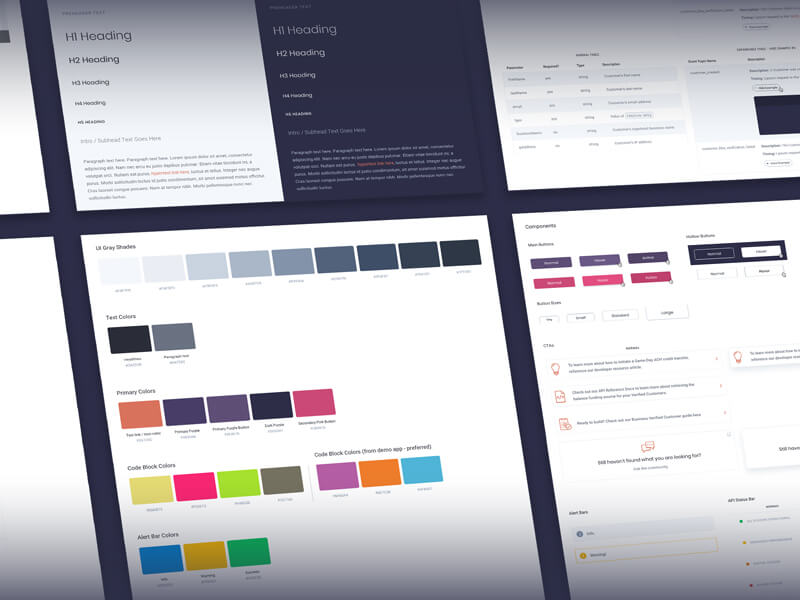
Dwolla Developer Portal RedesignUX / UI Design
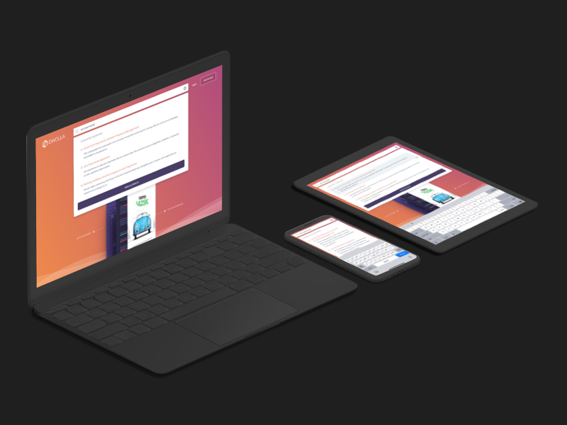
Global Search on Dwolla.comUX / UI Design
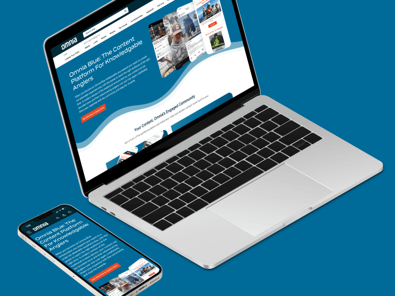
Omnia Blue Landing PageWeb Design
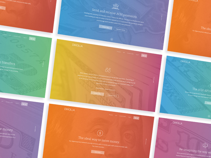
Dwolla Marketing Site RedesignWeb Design

Montoya Lawn & Outdoor ServicesBranding
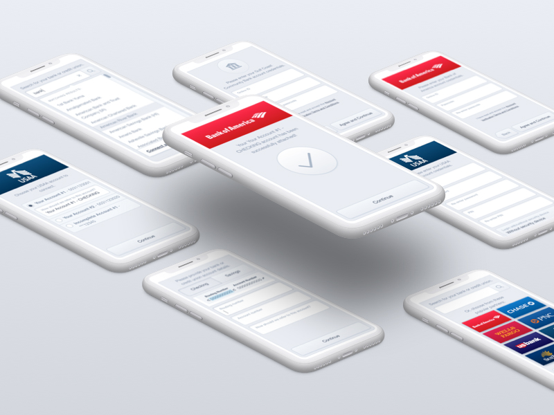
FinTech Product PrototypeUX / UI Design

Dwolla Core ValuesBranding

Landing Page GraphicIllustration
Red Benny Font SpecimenBranding / Typography

Office City Location IllustrationsIllustration

Louis C.K.Illustration
Flat Finance IconsIllustration
Democrat Republican LogoIllustration

Isometric IllustrationsIllustration
Flat Audience IconsIllustration
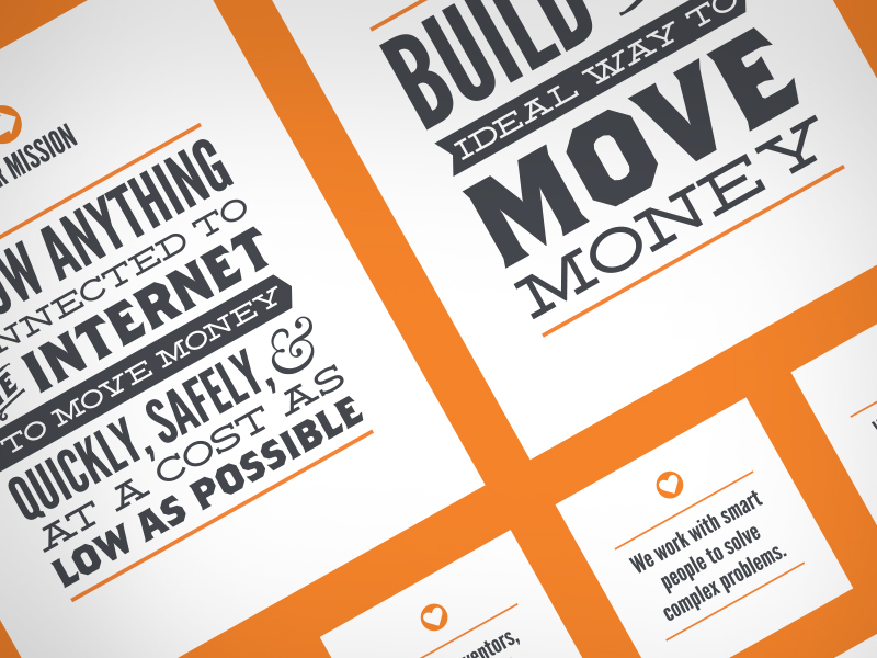
Dwolla Mission, Visions & ValuesTypography / Print
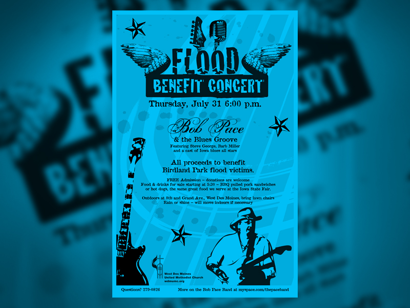
Food Benefit PosterPrint
