Sandbox Graphic & A/B Tested Landing Page
This is an isometric illustration I created for Dwolla, which was featured across the website and various marketing materials.
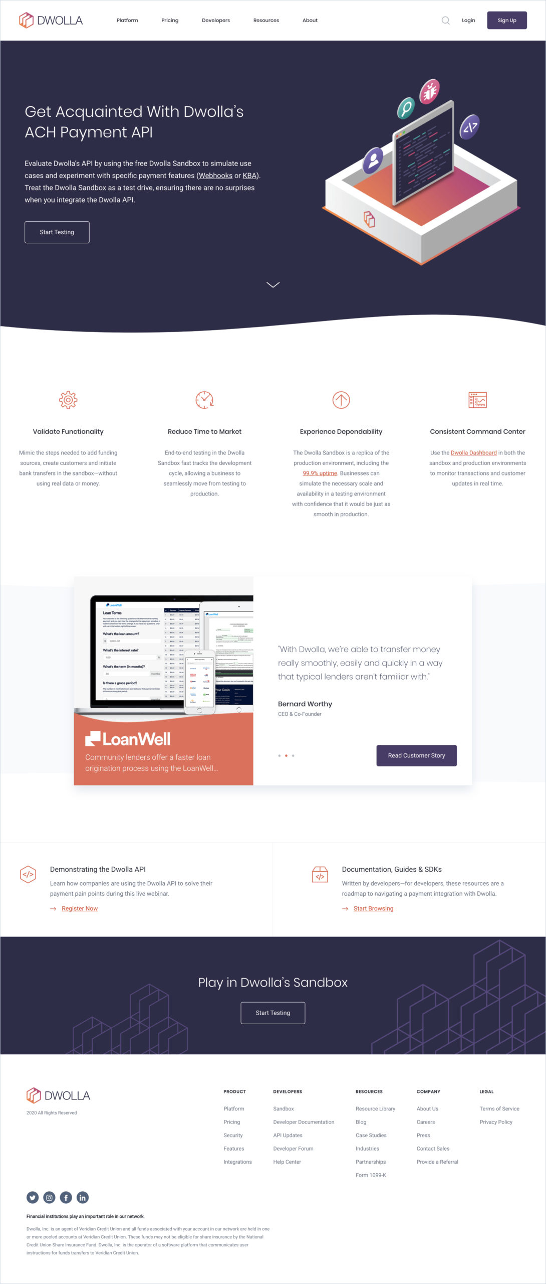
Below is a landing page I design, featuring the graphic we used. I collaborated with the Senior Digital Marketing Specialist to A/B test multiple landing page concepts. We experimented with different layouts and CTA placements, using analytics and heat maps to study user behavior and make data-driven decisions.
Ultimately, this version yielded the highest conversion rate. It includes:
- A clear call-to-action above the fold
- Four value propositions outlining features and benefits
- Customer testimonials to build trust and reassure viewers
A secondary call-to-action at the bottom of the page
Other Projects
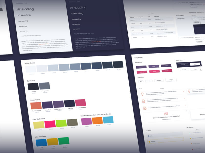
Dwolla Developer Portal RedesignUX / UI Design
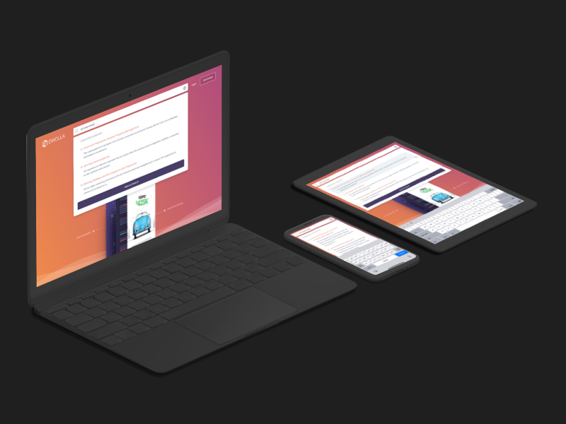
Global Search on Dwolla.comUX / UI Design
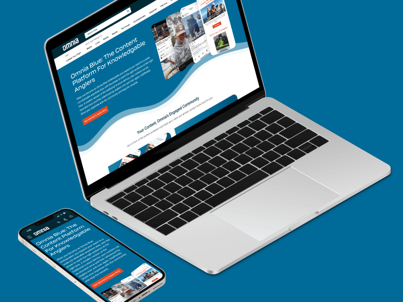
Omnia Blue Landing PageWeb Design
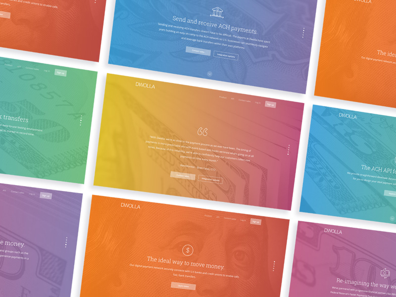
Dwolla Marketing Site RedesignWeb Design

Dwolla Identity Design SystemBranding

Montoya Lawn & Outdoor ServicesBranding
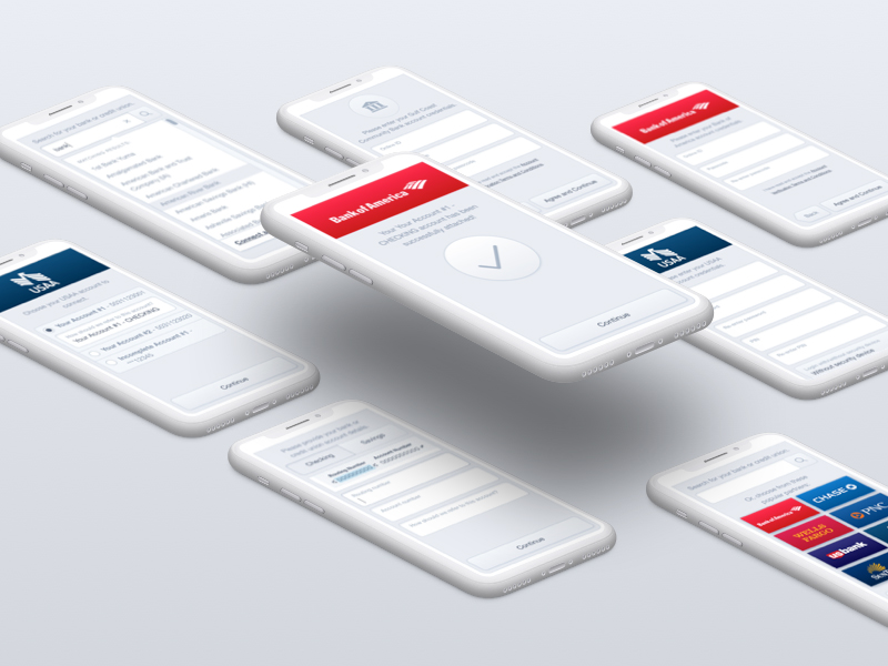
FinTech Product PrototypeUX / UI Design

Dwolla Core ValuesBranding

Red Benny Font SpecimenBranding / Typography

Office City Location IllustrationsIllustration

Louis C.K.Illustration
Flat Finance IconsIllustration

Democrat Republican LogoIllustration

Isometric IllustrationsIllustration
Flat Audience IconsIllustration

Dwolla Mission, Visions & ValuesTypography / Print
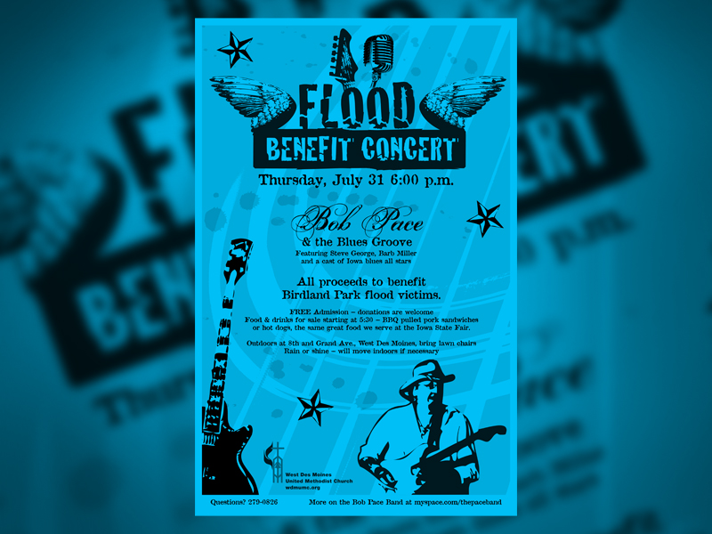
Food Benefit PosterPrint

